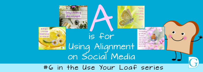
A is for Using Alignment on Social Media
This is the sixth blog in my graphic design series “Use Your Loaf”. Alignment for social media graphics is essentially no different from an alignment in print, except that the area is smaller.
Nothing should ever be placed in an image unless it has some connection with another element on the page.
I’m going to show you some basic alignments to get you inspired. Combined with the information in my previous blogs in the ‘Use Your Loaf’ series it will all flow pretty naturally!
- Need to Design for Your Social Media? Use Your Loaf!
- Is designing your own Social Media Posts stressing you out?
- B is for Building your Brand on Social Media
- R is for Using Design Relationships on Social Media
- E is for Using Echo on Social Media
If you have already read my previous blogs, you’ll remember to always leave enough space around elements in the design. This allows them to have full impact on your reader. Jamming too many images all on to one page will invariably just confuse your customer, resulting in them scrolling on.
Think back to your own experience of a supermarket shelf with 101 varieties of, say, cereal crammed on the shelf. Or that flyer through the door from your local takeaway - too much information can, and will, put people off.
The Basic Rules
The really BIG thing to remember, whatever layout you choose, is to ALWAYS ALIGN ACCURATELY.
NOTHING jumps off the screen and screams ‘amateur’ like wonky alignment does.
Once you have looked at my examples, free to experiment with your own logo, graphics, photos and text.
By remembering these basic rules of thumb you will begin to produce professional looking posts within minutes!
And if you like the images I’ve used, they are from our March Social Media done-for-you quote posts collection. You can grab them, completely unbranded, to use on your own social media. You can even add your own logo if you like!
Range Left
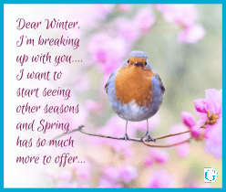 Aligning everything to an imaginary vertical line on the left of the page is called RANGE LEFT.
This is one of the safest options to go for as it echoes the usual reading format we are used to… Reading from left to right.
Range left results in a classic well organised if slightly ‘safe’ feel. Choose an interesting typeface to elevate the simplicity.
I’ve placed our logo on the right as a contrast. You can see how it gives a lovely diagonal sweep from the top left, through the image of the robin and down to the right. Using this trick, the reader’s eye is lead to the part I want them to remember.
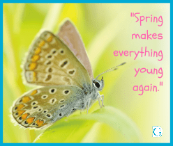
Centred
 Centring all your elements along the central vertical axis of your page gives a well-balanced and easily accessible feel to a layout.
Notice how I’ve centred the logo at the bottom of the page.
The white semi-transparent box, centred around the words, gives an airy and uncluttered feel to the image. This focuses attention and leads the eye to the logo at the bottom.
Range Right
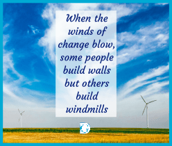
 When elements in a design are arranged on an imaginary vertical line a little way in from the right edge we call this RANGE RIGHT.
While being less conventional than range left, this look has a more modern feel. The straight line on the right leads the customer’s eye straight to your logo or call to action.
It’s in the bottom right corner for a reason. If this was a book, we would automatically go there to open it… and so, with social media, by using range right, we are subliminally inviting your readers to click to find out more.
Using visual clues in the images
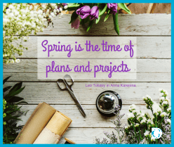 Notice how on the garden workbench image, the main quote has been centred vertically but also placed strategically between the boards of the bench image.
The attribution has been placed to the right, neatly aligned with the edge of the semi-transparent box. This leads the eye to the logo at the bottom.
Once you’ve learnt how the basic rules of alignment work with the eye, you can lead your viewer to where you want them to go. You will find that your social media visuals begin to get more engagement and generate more customer interaction.
Once you've learnt how the basic rules of alignment work with the eye, you can lead your viewer to where you want them to go. Share on XJust remember the basics:
Everything in your image needs to be aligned in some way to something else in the image.
- Make sure your visual lines are not wonky. If you are using text blocks, double check for spaces at the ends of words which can throw some lines off.
- Let the images you are using guide you – work with them not against them.
- Know where you want your viewer to begin reading and where you want them to end up. Lead them through your pre-planned path.
- Make sure your message is readable. Don’t sacrifice your message – that’s why you are posting after all!
- Brand everything – it doesn’t have to be big, but it does have to be there!
If you have been following my ‘Use Your Loaf’ B.R.E.A.D blog series, you will see how this fits into the basics of being your own graphic designer.
If you haven’t yet read them, please do go over to the website blog page and check them out. They are free to access, easy to read and will save you hours of stress and worry when it comes to making your own social media posts. I’ll even show you how to use Canva’s free software in my training videos which are also on the website with free access.
Takeaway Tip
Your takeaway tip from this week is:
Know where you want your viewer to begin reading and where you want them to end up. Lead them through your pre-planned path.
Know where you want your viewer to begin reading and where you want them to end up. Lead them through your pre-planned path. Share on XNext week I’ll be talking to you about the final element in the Use Your loaf B.R.E.A.D. series. This is
D is for Difference on Social Media
and I look forward to seeing you there.
And just to remind you, if you like the quote post images I’ve used here and would like to upload unbranded and royalty-free versions for use on your social media (a mega-timesaver!) click on the link and all the details are there!
Enjoy your designing and let me know how you are getting on!
See you soon,
![]()
