
D is for Using Difference on Social Media
Welcome to the last in the ‘Use Your Loaf’ blog series.
We have discussed Branding, Relationship, Echo and Alignment and we will round off the B.R.E.A.D. acronym with D for Difference.
Difference can be a real NO! if done badly, but show-stoppingly good if done with flair!
The rule of thumb here is if something is not ‘the same’ in graphic design it should be REALLY different.
“Be Different like you did it on purpose – NOT different like you hoped no one would notice!”
Be Different like you did it on purpose – NOT different like you hoped no one would notice! Share on XThis applies equally to your:
- Typefaces
- Brand colours
- Illustration style
- Logo
But will it actually matter?
Absolutely, yes!
You might not think that there is much difference between one similar typeface and another. However, when you are building your brand consistency really matters.
Take a look at the two illustrations here.


These sans serif typefaces are all very similar at first glance, but if you look more closely you will begin to notice differences.
The same applies to the script typefaces in the second illustration.
As you will now be aware, if you have read the other blogs in this series, brand recognition, which leads to KLT (know, like and trust) happens subconsciously over time.
BUT it ONLY works if you are consistent. All those seemingly minor differences, even if they are not noticed consciously by your viewer, will break the pattern subconsciously.
The same applies to ‘near-enough’ colour choices.
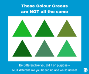
If an element is part of your branding, if it’s not EXACTLY the same every time, it is damaging.
If an element is part of your branding, if it's not EXACTLY the same every time, it is damaging. Share on XWhen a professional graphic designer designs branding for a client, they should always supply a ‘brand book’.
If you don’t have one, ask your logo designer - they should be able to tell you what you need to know.
If you don’t have a designer, make yourself a ‘brand book light’ by finding out the following brand critical elements:
Your typefaces
- The name of each font used –
e.g., Helvetica, Arial, Lato, etc.
- Their weights
e.g., light, regular, bold, etc.
- Their aspect
e.g., Italic
Your Brand Colours
- These will be in the form of Hex codes and will start with a # followed by 6 numbers or letters e.g., #00aaD4 (see my blog E is for Using Echo on Social Media for more details on this).
- Hex codes are used by designers to specify particular shades of colours and are so fine that there are 16,777,216 different ones!
- Make sure you know what your codes are.
Illustration style
- If you use illustrations drawn by more than one artist, make sure they are REALLY different styles.
- Like handwriting, every artist’s work has a certain signature and trying to pass one off as another will stand out a mile to your audience.
- The best solution is to find a core artist whose work you like and who has a portfolio of work suitable for your needs.
- You can supplement these core illustrations with others, but make sure they are sufficiently different not to look like you hoped no one would notice.
Logo
- This one is EASY!
- Your logo colours should be fixed.
- You should have your core logo on a clear background which will fit in a square.
- You should have a long logo on a clear background which will fit in a line.
- A black and/or white version of each.
However…
This doesn’t mean you can never do anything big and bold and completely off brand… as long as it’s done with style and conviction.
(Just remember to keep any elements of your branding the same as always when you do!)
Takeaway tip:
Be Different like you did it on purpose – NOT different like you hoped no one would notice!
Be Different like you did it on purpose – NOT different like you hoped no one would notice! Share on XSo that brings me to the end of my Use Your Loaf - B.R.E.A.D. blog series.
I hope you found it useful and that you now feel more confident when you are being your own graphic designer on social media.
Please do browse our website and take a look at the downloadable graphics collection, the social media planners and get inspired by our blogs.
And remember, I’d love to hear from you, so please leave a comment below or in our Facebook Group.
![]()
