E is for Using Echo on Social Media
Echo is one of the basic principles of branding that professional graphic designers use without thinking, but amateur designers seem to go out of their way to avoid.
Let me explain…
Conventional thinking leads us to believe that you need to post NEW and EXCITING images all the time. In reality, to attract your customers’ attention over the ‘noise’ of all the other social media and advertising out there, what actually WORKS is the opposite.
Let’s do a social media experiment…
If you take off your business marketing hat for a moment and put on your consumer hat, let me ask you these three simple questions:
- Do you get confused and overwhelmed by too much choice and keep scrolling?
- Do you tend to stop scrolling when you see something you vaguely recognise?
- Are you more likely to read posts from, interact with and trust brands and businesses you are familiar with?
I’m sure you answered ‘yes’ to all three of these questions.
However, much we may feel that our product or service is ‘new’, ‘radical’, ‘exciting’ and ‘different’ it’s human nature to be drawn to the comfortable and familiar, low-risk options when we are decision-making.
This is where Echo plays a part.
Branding works on the part of the brain that recognises patterns. And the more often you can imprint your patterns on the mind of your target market, the more familiar they will become with your brand and begin to absorb your messages.
It is said by many leading marketing practitioners that it takes at least 8 ‘brand touches’ before a mind begins to recognise a brand as familiar, and then another 8 before ‘know-like-and-trust’ is established.
Here are the principles for using Echo on Social Media
1. Use your branding consistently
Use your logo on everything
It doesn’t need to be big, but it does need to be there.
Use your brand colours on everything
You should only have 2 colours (in 3 hues of each: light, medium and dark), plus black and white. Stick to them EXACTLY. No really… a ‘near-enough’ shade is not good enough here… it must be EXACT every time. For this, you need to know your Hex codes.
If you already know your Hex codes, super!
 If you don’t then I suggest you log onto a useful free Hex picker tool such as https://imagecolorpicker.com/. There are others you can use that do the same job.
You can upload any image, e.g., your logo, click on the colour you want to know the Hex code for and it will tell you.
The code will begin with # and then have a combination of 6 numbers and/or letters for instance #01AAD5 or #F94B6C.
Write yours down somewhere you can refer to – mine are on the front page of business my diary - and use them everywhere.
The Principles for using Echo on Social Media. #1 - Use your branding consistently. Share on X
2. Choose three typefaces and stick with them
You need:
- A typeface for your HEADERS (Be bold!)
- A typeface for your TEXT (make sure it is easy to read)
- A SCRIPT typeface (for when you need to grab attention).
Key things to take into consideration when choosing your brand’s typefaces are:
- Your brand personality
- Your target market customer
- A text typeface that has variations such as light, bold and italic.
Then, type out a few examples of things you are likely to write in each style. If you find it hard to read, your customers will too.
The Principles for using Echo on Social Media. #2 - Choose three typefaces and stick with them. Share on X
3. Choose consistent images and graphics
Remembering the Echo principles, it really pays to develop a signature brand style using images drawn by the same designer in the same style.
If you can afford to hire a graphic designer to draw images for you that’s fantastic. If not, it will help you if you find an illustrator whose work you like and who has enough variety.

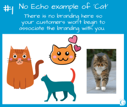
Example #1 here shows a ‘No Echo’ example of a cat illustration. There is no style continuity here, so your customers won’t begin to associate the branding with you.
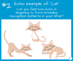
 Example #2 shows what happens when you use images that are drawn in the same style. Even if they appear on different posts over time, can you see how Echo will begin to form branding recognition patterns in the brains of your audience?
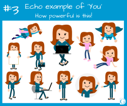
 If you can find a cartoon person, who looks a little like you, and is available in a variety of poses, e.g., walking, showing, sitting at a computer, holding a blank poster, as in Example #3, it will begin to activate Echo in your posts.
 Likewise, a variety of ‘same style’ desk images, such as a notebook, laptop, coffee cup, pen or diary, in your brand colours placed strategically on your posts really start to make the connection with your audience.
And because you now understand the phenomenal power of Echo you won’t be afraid to use them over and over!
The Principles for using Echo on Social Media. #3 - Choose consistent images and graphics. Share on XTakeaway Tip
So, your takeaway tip from this week is:
Once you have found your signature style, Echo really is your brand’s best friend.
Takeaway Tip: Once you have found your signature style, Echo really is your brand’s best friend. Share on XBecause Echo is such an important part of a successful business brand, and because we know you have limited time and resources to search around for your ideal images, Kim and I created the Be Your Own Graphic Designer collection.
So if you’d like to browse through over 3,000 downloadable colour-coordinated images, like the ones shown in example pictures #2,#3 and #4, these elements, and many more, are all available for you to buy and download from our Collection, together with instructions on how to make your own social media posts, for free, in our How-To section.
I’d love to hear from you, so please comment below!
See you for blog #6 in the Use Your Loaf series –
A is for Using Alignment in Social Media images.
It will be coming out next week.
![]()
