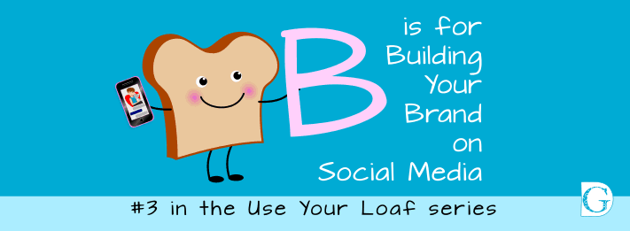
B is for Building your Brand on Social Media
Building your Brand on Social Media is blog #3 in the Use Your Loaf series
To help you to begin to build your brand on social media, this blog is written from a graphic design perspective. It is therefore quite different in scope from our Why you should fall in LOVE with your brand blog which talks about the role of the brand and why you really do need one to be successful in business today.
Almost invariably the very first things most new business owners do when they decide to build their brand is to:
1. Think of a name for their new business.
2. Choose their favourite colours.
3. Get a logo designed.
If this sounds like the branding path you took, you are not alone.
You have your ‘brand’ – now what do you do?
Kim and I have been working with small businesses for many years, Kim on marketing and social media and myself on design. We regularly find that our clients have poured their heart and soul into their venture… but then come to a crashing halt when it comes to getting out there and telling their target market about it.
Put simply, Building your Brand on Social Media is about applying the following five elements over and over again consistently in EVERY interaction your business has:
-
Your brand logo
-
Your brand colours
-
Your brand typefaces
-
Your brand attitude
-
Your brand voice
Let me run through those with you one by one.
Building your Brand on Social Media is about applying your brand logo, brand colours, brand typefaces, brand attitude and brand voice over and over again consistently Share on XYour brand logo
Firstly, don’t rush out to change your logo – you probably don’t need to do that.
There are basically just three types of logo:
Text logos, Image logos, and Abstract symbol logos (although some logos are a mix of these types).
A Text Logo
A text logo is simple and just presents the name of the company or a letter associated with it. Think of Google’s simple lettering. Most companies use their name as a logo. Only very recognizable brands can get away with never using any text at all.
An Abstract Symbol Logo
An abstract symbol logo is something like Nike’s swoosh. It doesn’t say the company’s name or show an item related to the company, but somehow the implied movement of the swoosh communicates the brand’s message.
An Image Logo
Image logos show an image related to the company such as the apple that is Apple’s logo.
Often abstract and image logos are used with the name of the brand in combination, for example, the Pringles logo.
Your Brand Colours
 A contemporary logo should be as simple as possible and consist of just one or two main colours. These colours are usually any combination of 2 of the following: Blue, Turquoise Blue, Green, Yellow, Orange, Red, Pink, Purple or Brown.
The colours need to be carefully considered from the point of view of your customers, as each colour sparks certain associations in the mind. What colours do you think your ideal customers will respond well to? If in doubt, look at what they currently buy and note the colours used by those outlets’ logos.
You can then go for a light, medium and dark version of the colours you settle on – but stick to the same hue or it will look awful.
A contemporary logo should be as simple as possible and consist of just one or two main colours. Share on XIn addition to these two colours, you can use Black and White freely.
“But my logo has loads of colours in it….”
Don’t worry, if your logo is more complicated than this, or has multicoloured elements. Just pick TWO of the main colours in the logo to become your brand colours but carry on using your colourful logo alongside.
(If you are REALLY concerned about your logo, why not post it in the free Be Your Own Graphic Designer Facebook group. We’ll be happy to take a look at it for you and make some suggestions).
The reason the nine colours listed above tend to be chosen is that these are the colours human beings relate to on an emotional level. Branding is after all about engaging the emotional part of the brain.
To read more about colour theory and how it affects us please read ‘Branding? .K.I.S.S. and move on’ on our website blog page.
It really helps to have a ready-made resource of stock images in your colours which you can just pop into your social media or onto your website. Every time you use your brand colours in association with your business, you are reinforcing your brand in your prospective customer’s mind. The big brands know that colour is a powerful tool for getting right into the subconscious. You should follow their lead and use it too.
To make life easy for you, we have designed an ever-growing collection of over 1,500 downloadable colour-coordinated clear backed, royalty and copyright free images for you to browse through so you can get inspired! Just click here to visit The Collection. and take a look!
Your Brand Typefaces
You need three.
-
A typeface for your HEADERS (Be bold!)
-
A typeface for your TEXT (make sure it is easy to read)
-
A SCRIPT typeface (for when you need to grab attention)
Your Brand Attitude
Seriously, you need to think about this before you start your branding journey… but there is really only one way to go…Be yourself.
-
If you are loud, opinionated, colourful and confident then go with that
-
If you are quiet, down to earth, thoughtful and caring go with that
-
If you like fun, frivolity and frilly pink everything… (you guessed it) … go with that.
These days customers are savvy and educated, and if they even smell a whiff of insincerity in your brand attitude they will run a mile. The only way to guard against that is to always be yourself – flaws and all.
We guarantee some will love you for it – of course, some won’t, but are those the guys you’d really want to work with? Believe us, the ones you ‘click’ with will love you for being you!
So to re-cap…
-
Create a ‘SIGNATURE BRAND STYLE’ and stick with it.
-
This does not mean every post has to look identical, but they must have the same ‘feel’ (a brand is a ‘feeling’ not a set of rigid rules)
-
Pick two brand colours from your logo and stick to hues of them plus black and white.

-
Pick three typefaces – make sure they CONTRAST.
-
Always use your logo on everything. It doesn’t have to be big, but it does have to be there.
-
Always put your www. on every post so viewers can get in touch.
-
Don’t expect miracles to happen overnight – brands are like fine wines – they take time to develop.
Takeaway Tip
So, your takeaway tip from this Graphic Design for the Bewildered – B is for Branding blog is:
Create a ‘SIGNATURE BRAND STYLE’ and stick with it
Takeaway Tip: Create a ‘SIGNATURE BRAND STYLE’ and stick with it Share on XOf course, this is just an overview – Building brands online is a big topic!
If you want to find out more about how you can be your own graphic designer, begin building your brand and take the mystery out of designing, please visit us on the BYOGD website or join our free Facebook group. We have how-to videos, blogs and loads more content to help you become stress-free and super speedy on your social media!
Kim and I would love to hear from you.
And remember to look out for #4 in the Use Your Loaf series:
R is for Using Design Relationships on Social Media
If you like the images in our blogs, images like these are available for you to buy and download from our Collection, together with instructions on how to make your own images in our How-To section.