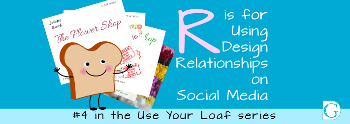
R is for Using Design Relationships on Social Media
In graphic design, elements which are related to each other in some way should always be visually grouped together. This is known as forming Design Relationships. Doing this makes it easier for the viewer to understand what their design relationships are. It also helps your viewers make sense of what they are seeing, reduces clutter and makes for a clear visual structure.
Forming Design Relationships by grouping related items together makes it easier for the viewer to understand what their design relationships are. Share on XNon-designers tend towards using every little bit of available page space, with elements stuck in corners and all text as large as possible.
This results in unorganised confusion, with all the elements vying for the attention of the reader, and all at the same time.
After an initial inward ‘Arrgh!’ your potential viewer will move on, unwilling to spend time or brain power on trying to decipher your message. What a missed opportunity!
However, a well-organised piece of graphic design, incorporating structured design relationships, will take the reader’s eyes on the journey you intend.
Viewers will start in the place you want… understand the message… and finish on the ‘call to action’.
For Social Media, this is usually a link to your www. or your landing page. In the case of business cards, it’s likely to be your phone number. For posters advertising an event, it would be the ticket office url.
As an experiment, I’d like you to look at text layout #1.
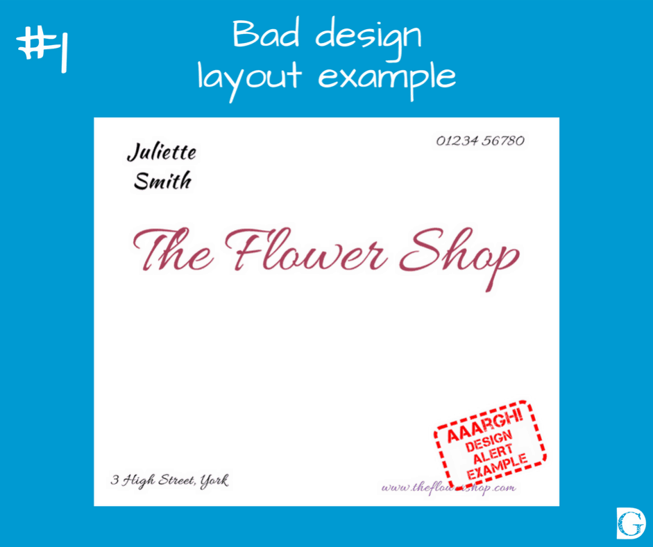
This is a typical bad example of a design layout, but I’m sure you have seen similar many times.
While you are looking at the image, become aware of how often your eyes are moving as you try to make sense of what you are seeing…
- Did your eyes stop five times? There are five elements, so that is expected but did you find yourself unable to judge if you had taken in all of the information?
- Did you find your eyes were still flitting about and checking to make sure?
What did you read first?
- I predict you started in the centre as that is the biggest, but were your eyes attracted to the bold black type in the top left corner? Or were your eyes distracted by the colour in the bottom right corner?
- Did your eyes flit between these elements as you tried to establish which was more important?
- Were you bothered by the two different script typefaces?
What did you read next? Did your eyes move to the left or the right? Up or down?
- Was the number in the top right the phone number? If so, why was it nowhere near the invitation to phone? Are they related?
- Were you distracted by the text in the corners not being level or lined up exactly with the other elements on the page?
As you can see from the example, there are no design relationships and so the eye is confused.
Let’s make things worse by adding some images. See layout #2
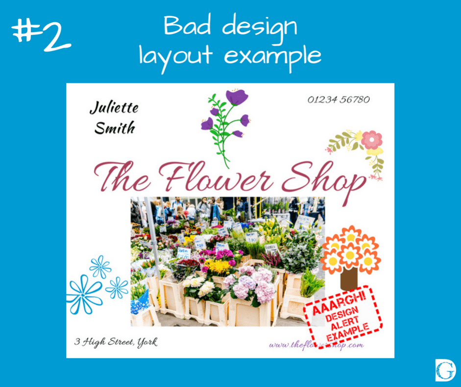
As you can see, the novice designer has tried to fill every bit of white space with her logo and relevant images of flowers, including a photo of her shop.
Are you now having an Arrgh! moment?
Look at the image for a few moments and try to work out why…
(I’ll do a checklist at the end so you can see if you spotted the main issues!)
Now let’s look at putting the rule of Design Relationships into play and re-visit the rule of Branding to make this better.
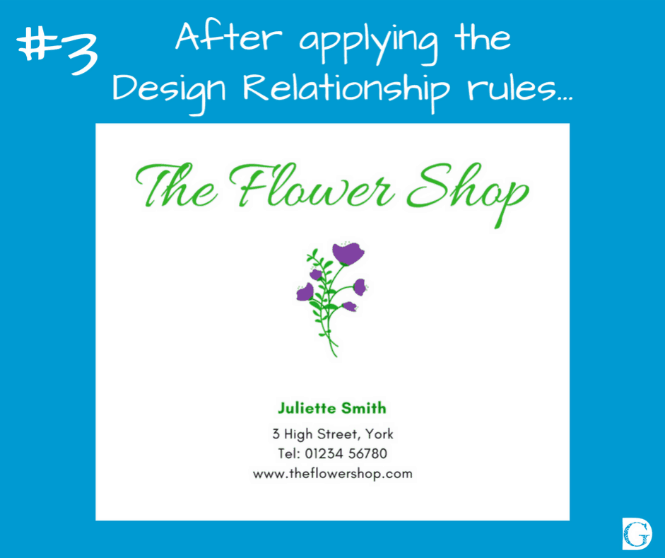
The Design Relationship rules are:
- Always use your logo, but it really doesn’t need to be overly big.
- Group similar text elements together, e.g., the address and telephone number.
- Make the lead text (the ‘hook’) element the biggest and use your heading or script typeface. Tie the colour into your main branding colour (see your logo for reference).
- Use your sans serif typeface in bold for the next level of importance, but not too big. Use one or other of your two branding colours for it.
- Add less important information, e.g., address, phone number and website address using your un-bold sans serif typeface. Use either one of your branding colours for it, black or reverse it out of a dark background in white.
- Make sure you align things correctly – either range LEFT, range RIGHT or CENTRED.
- Don’t be afraid of leaving space in your design.
- Be accurate.
- Be bold.
To test if your design is a good one, ask yourself:
- Is it clear where my viewer will begin reading?
- Is it clear where they should finish reading?
- Have I left enough space in my design?
- Are the relationships between the text and images working?
- Have I used my brand colours?
- Did I stick to my brand typefaces?
- Is my logo on it?
- Will people know how to contact me from it?
Takeaway Tip
So, your takeaway tip from the R is for Using Design Relationships on Social Media blog is:
“Become aware of how often your eyes are moving as you try to make sense of what you are seeing…”
Takeaway Tip: Become aware of how often your eyes are moving as you try to make sense of what you are seeing Share on XOf course, this is just an overview. Building brands online is a big topic and ‘R’ is just the second letter in the B.R.E.A.D. acronym!
If you want to find out more about how you can be your own graphic designer, begin building your brand and take the mystery out of designing, please visit us on the BYOGD website or join our free Facebook group. We have how-to videos, blogs and loads more content to help you become stress-free and super speedy on your social media!
Kim and I would love to hear from you.
And remember to look out for #5 in the Use Your Loaf series:
E is for Using Echo on Social Media
If you like the images in our blogs, images like these are available for you to buy and download from our Collection, together with instructions on how to make your own images in our How-To section.
And finally, if you are itching to find out if you spotted the main issues with layouts #1 and #2, here is a checklist of things to watch out for. There are others too which I will be addressing in my next blogs in this series. How many did you spot?
Image problems checklist:
#1
- Group related elements together, e.g., address and phone number.
- Align the edges of type – top, bottom, left and right along invisible lines of sight.
- Never use two script typefaces together – it is best practice to use a script typeface for main headers only and a sans serif face for information.
- Choose colours that are your BRAND colours.
- Make sure that if elements are meant to be the same (e.g., same typeface or colour), they are EXACTLY the same – near enough is not good enough.
- If you want something to be DIFFERENT make it REALLY different.
- Become aware of how your eyes are moving around the page – eliminate random flitting about by imposing structure.
#2
- The Flower Shop logo (the purple flower) is lost amongst all the other images.
- If you are using photos zoom in or crop them to show specific areas of interest.
- If you are using graphics, make sure they are all in the same style and that the colours are harmonising with your brand colours.
- You DO NOT have to fill every available piece of space!
#3
- The information in #1 has now been simplified by applying the Branding and Relationship rules.
- Notice how your eyes are led through the information.
- Notice how the colour of the logo is echoed in the typefaces.
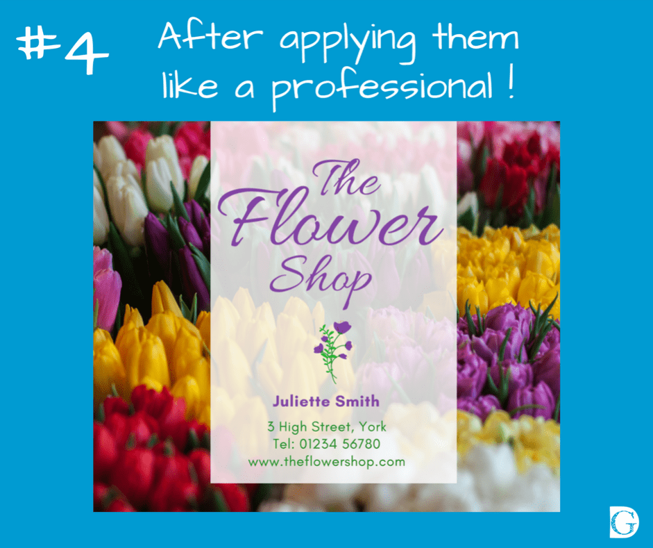
#4
- Once you have the basics you can begin to use the rules like a professional!
I’d love to hear your comments,
Best wishes and see you soon,
![]()
