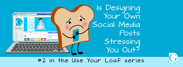
Is designing social media posts stressing you out?
Here’s a beginner’s guide.
The easiest way to remember the five main principles of graphic design is to remember the acronym B.R.E.A.D.
Bread is one of our staple foods and easy to take for granted, but if graphic design bewilders you, this little trick really helps!
BREAD is an easy way to remember the five main principles of graphic design - Branding; Relationship, Echo; Alignment, and Difference #BYOGD Share on X The first thing to know is that we buy bread by the loaf, not by the slice, so it is important to remember that these 5 slices never happen alone.
To be your own graphic designer, you need to understand the function of each slice!
So if designing your own social media posts is taking you more time and causing you more stress than you want, read on…
B is for BRANDING
Branding is so much more than just your logo.
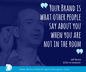 Your brand is represented by your colours, your typefaces, your philosophy and your ethics all rolled into one. But it’s more than that - It’s the feeling that people get when they hear your name or see your logo. It’s about how you do business, how you treat your customers and, above all, as Jeff Bezos, CEO of Amazon, once said:
“Your Brand is what other people say about you when you are not in the room.” Jeff Bezos
'Your Brand is what other people say about you when you are not in the room' Jeff Bezos #BYOGD Share on XAnd remember this reputation can be excellent – or it can be bad.
Now, of course, a ‘bad rep’ can’t be solved by anyone but you. But if people like what you are doing AND how you go about doing it, then consistent branding will help you to grow your following and increase your number of paying customers.
The next blog in this series focuses on Branding and goes into more depth about what you can do using your existing logo and brand colours to really start to get noticed by your target audience.
R is for RELATIONSHIP
In graphic design, elements that are related to each other in some way should always be visually grouped. This makes it easier for the viewer to understand what they are seeing, access the information and make sense of the message you are sharing.
Relationship makes it easier for the viewer to understand what they are seeing, access the information and make sense of the message you are sharing. #BYOGD Share on XIf you imagine a busy high street, you are immediately aware of who is with whom. For example, a mother and a toddler in a buggy walk by; 3 or 4 teenagers, wearing hoodies and slogan t-shirts are gathered outside a fast food shop listening to loud music; an elderly man in a business suit is sitting on a bench talking to a policeman. This all makes sense - it is as expected and is therefore easy to ‘read’.
If, however, the toddler was alone in the buggy outside the fast food shop, the teenagers were wearing business suits and were standing silently apart from each other, the mother was listening to loud music on her own, the elderly man was dressed in a hoody and the policeman was jogging, things would seem a bit strange… even though the elements are the same.
It’s the same for a piece of design work - all the elements can be there, but if the relationship is not right it doesn’t make sense and seems ‘wrong’ to the viewer.
How you spot where relationships are working and where they need fixing is covered in blog #4 of this series.
E is for ECHO
You may not have noticed but clever design repeats itself constantly with little echoes on the page. Sometimes a colour is echoed but paler or darker; a typeface is reused, but bolder, lighter or italic; a shape or angle appears again, but this time in the white space between the words and images.
Clever design repeats itself constantly with little echoes on the page. #BYOGD Share on XOnce you have sorted out your Branding and Relationships, Echo provides subtle visual clues to your viewer. It’s this element that so many untrained designers often get wrong. It’s not that it’s difficult. In fact, it’s SO easy that most non-designers think they need to do more…and end up mucking it up!
You will begin to recognise how to use echo easily and effectively in your branding. Also, how powerfully it can affect the memorability of your brand as a whole.
Read more about this in blog #5.
A is for ALIGNMENT
Alignment is the invisible scaffolding that holds a strong piece of design together. It stops it from falling to pieces in front of the viewer’s eyes. Misaligned images and typefaces create a feeling of ‘wrongness’ and grate on the senses and it’s SO easy to fix once you recognise there is an issue.
Alignment is the invisible scaffolding that holds a strong piece of design together and stops it from falling to pieces in front of the viewer's eyes. #BYOGD Share on XYou know that feeling when you see a piece of graphic design that just looks SO amateurish, but you can’t put your finger on why.
We’ll show you how to sort that out in blog #6.
D is for DIFFERENCE
And finally, in design, if something is not the same it should be REALLY different!
Similar is no good here. Similar is wishy-washy and safe. To make your designs stand out, you need to learn how to use CONTRAST.
Difference is the thing that makes one piece of design jump off the page and commands the viewer’s attention.
Difference is the thing that makes one piece of design jump off the page and command viewer’s attention. #BYOGD Share on XUse it wisely. Use it boldly!
Blog #7 will show you some examples and give you the confidence to start experimenting.
So now you are aware of the 5 slices of B.R.E.A.D. and have an overview of the critical role each plays.
The next five coaching blogs will look at each ‘slice’ in detail. There are visual examples for you to follow so that you begin to understand the difference that good design principles can make to your work. These skills will enable you to design your posts quicker, work smarter and know that your message is getting through to your customers loud and clear.
Which bits of designing social media posts are you struggling with right now?
Which bits of your graphic designing are you struggling with right now? We'd love to hear from you #BYOGD Share on XI’d love to hear your comments so please do leave me a message in the comments box below or join us in our free Facebook group.
Takeaway Tip
Today’s takeaway tip is:
Designing social media posts is not that difficult. In fact, it’s SO easy that most non-designers think they to add more…and end up mucking it up!
Designing social media posts is not that difficult. In fact, it's SO easy that most non-designers think they to add more...and end up mucking it up! Share on XHope to hear from you soon,
Sammy
#BYOGD
This is the second blog in the series from www.BeYourOwnGraphicDesigner.com.
If you like the images in our blogs, images like these are available for you to buy and download from our Collection, together with instructions on how to make your own images in our How-To section.