A-Z of Design Terms for Non-Graphic Designers (continued)
N to Z
Negative Space
![]()
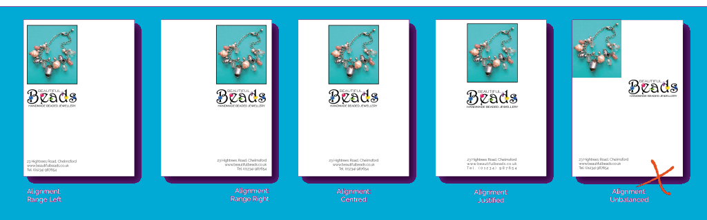
Negative space is a term used by designers to describe areas within a design or on a page where there is just blank space with no words or illustrations in it at all.
Often called ‘white space’, negative space does not have to be white, but it does have to be empty.
Professional designers know the importance of leaving plenty of negative space in a design, and non-professionals do tend to give the game away by trying to cram too much onto a page at once.
Just as it is important to be aware of how elements of the design are aligned and work with each other, it is also important to be aware of the effect of the negative space on the overall design as well.
In the examples below, you can see how the negative space on each of the first 4 brochure covers is working to draw attention to the graphics and gives a sense of quality to the cover.
It is also apparent that in image 5, the negative space is fighting the design resulting in a bad layout.
Noise
![]()
 Noise in design terms is the formation of groups of random uniformly coloured pixels in low-quality bitmap images.
When photos and illustrations are saved into a bitmap (e.g., PNG) or lossy (e.g., Jpeg) format the information is stored as pixels to reduce the file size and to make it compatible with software.
Each pixel is made up of a colour and at high resolutions (normally 300 dpi/ppi or above) this results in a high-quality image.
However, as the resolution goes down, for example to 170 dpi/ppi, or even lower, the file size gets smaller but the pixels get bigger resulting in loss of quality.
The pixels save on storage space by grouping together to make bigger pixels and have to ‘choose’ a colour to become based on the colours in the group.
Noise is created when pixels in a certain area of a photo or image ‘choose’ to save as a colour that is completely wrong for that area of the picture and can result in unexpected (and irreversible) speckles, flares and polarized effects.
Vector graphics (e.g., SVG ) do not have this problem as they do not have pixels, but while illustrations are perfect for saving as vectors (and this is the preferred file type all professional graphic designers use to save their originals in), it’s still preferable to save photographs as high-resolution Jpegs or PNGs.
Nodes
![]()
Know your Nodes.
Vector graphics have nodes - put simply, these are the points which connect the lines which create the shapes.
It’s a bit like join the dots for designers!
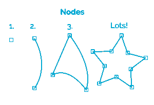
- You need at least two nodes to form a line.
- You need at least three nodes to form an enclosed shape.
- There is no limit to the number of nodes you have.
- Nodes can be at points or on curves.
Nodes are movable, can be added, can be deleted and are really useful to get the hang of!
Opacity
![]()
 Opacity refers to how opaque (non-see-through) or transparent (see-through) a colour, photo or image is.
Using modern graphics programs it is easy to adjust the opacity of an image to achieve a variety of exciting effects and layers.
It is also useful for ‘knocking back’ photographs to make them really pale and usable as a background for putting text on top of.
Outline
![]()
An outline is simply a graphic, illustration or typeface which has an outline around its edge.
Outlines do not have to be plain - you can vary the colours, widths, gradients & fills.

Page Layout
![]()
 A page layout works with a grid to ensure that all the elements on a page (e.g., for a brochure or catalogue) look like they belong to the same publication or set of advertisements.
Non-printable keylines are often used for one-off layouts but for a regular publication or advertising campaign an actual grid will be set up to reuse for the next edition or advert.
Grids are also used to show where folds appear for example in a 3 fold leaflet.
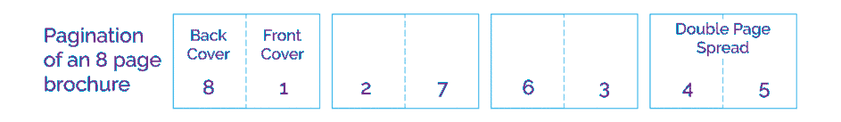
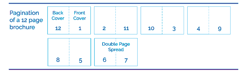
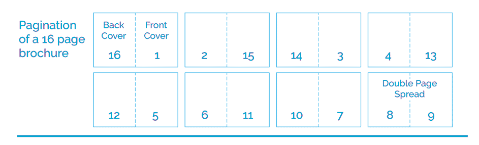
Pagination
![]()
When designing brochures be aware that the pages are set up to be printed in a different order in order to be right when the brochure is put together after printing.
Also, brochures always come in groups of 4 pages - so 4, 8, 12, 16, 20, 24 etc.
Here is a quick guide to help you plan.
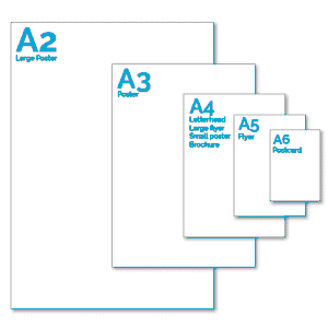
Paper Sizes
![]()
Paper sizes in the UK are measured in ‘A’ sizes.

![]()
 PDF stands for Portable Document Format.
When designers send items for printing, the printer will usually ask for a PDF.
The PDF format enables files to be downloaded via the internet and opened with no loss of clarity.
For those of you who would like more technical info, here is a link to Wikipedia’s PDF page.
Pixel
![]()
![]() Pixels are the annoying little squares of colour that give some images and photos that ragged low quality look if they have been saved at too low resolution or if an image, which has been saved as a small image, is stretched to a size bigger than it was saved at.
Pixels are the annoying little squares of colour that give some images and photos that ragged low quality look if they have been saved at too low resolution or if an image, which has been saved as a small image, is stretched to a size bigger than it was saved at.
Pixels are a way that some ‘old school’ graphics programs (e.g., Publisher, Word, PowerPoint) store images to reduce the file size. They save as Jpegs, PNG, GIF and other formats.
These pixelated files are referred to as ‘bitmaps’.
 When professional designers work, they use a new type of graphics package called a vector file (SVG - Scalable Vector Graphics) which enables illustrations, logos and other design elements to be saved with no pixelation or loss of quality, however much the image is stretched.
This enables them to create, say, a logo once, and then store it for resizing easily at any time with no loss of quality.
However, the image you receive will be in a PNG or Jpeg format, with the pixels sized to your particular application, e.g., business card size. If you want to then stretch the image to put it on a website, poster or billboard you would have to go back to the designer to get it re-sized or the pixels will become really noticeable.
Note: Trying to re-save a pixelated image as an SVG to try to regain some of the quality won’t work - it is a one-way change, so just because a file may be re-saved as an SVG it may actually be an SVG of a Jpeg and will still have pixels. Trust your eyes - not the label!
PNG
![]()
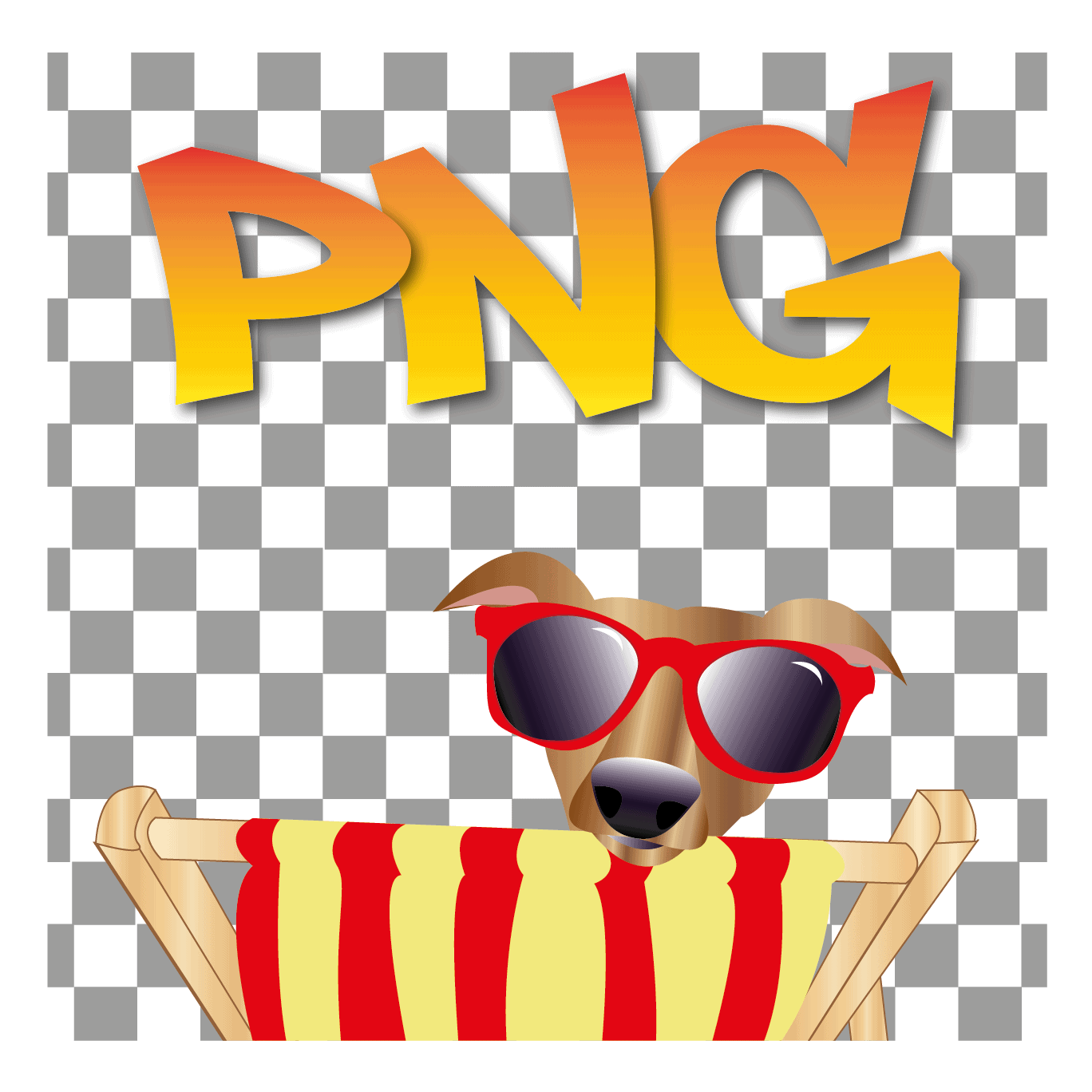 PNG stands for Portable Network Graphics and is called ‘Ping format’ in the trade!
While not being pixel-free like Vector files, PNGs do offer a lossless form of data compression combined with reasonably sized data files.
Because of this, PNG files are often used for web graphics where larger file formats may cause slower loading speeds to occur.
The pictures shown here on this website are PNG files.
The other great thing about PNG files is that, like Vector files, they can be saved with transparent backgrounds, which enables the designer to layer up images.
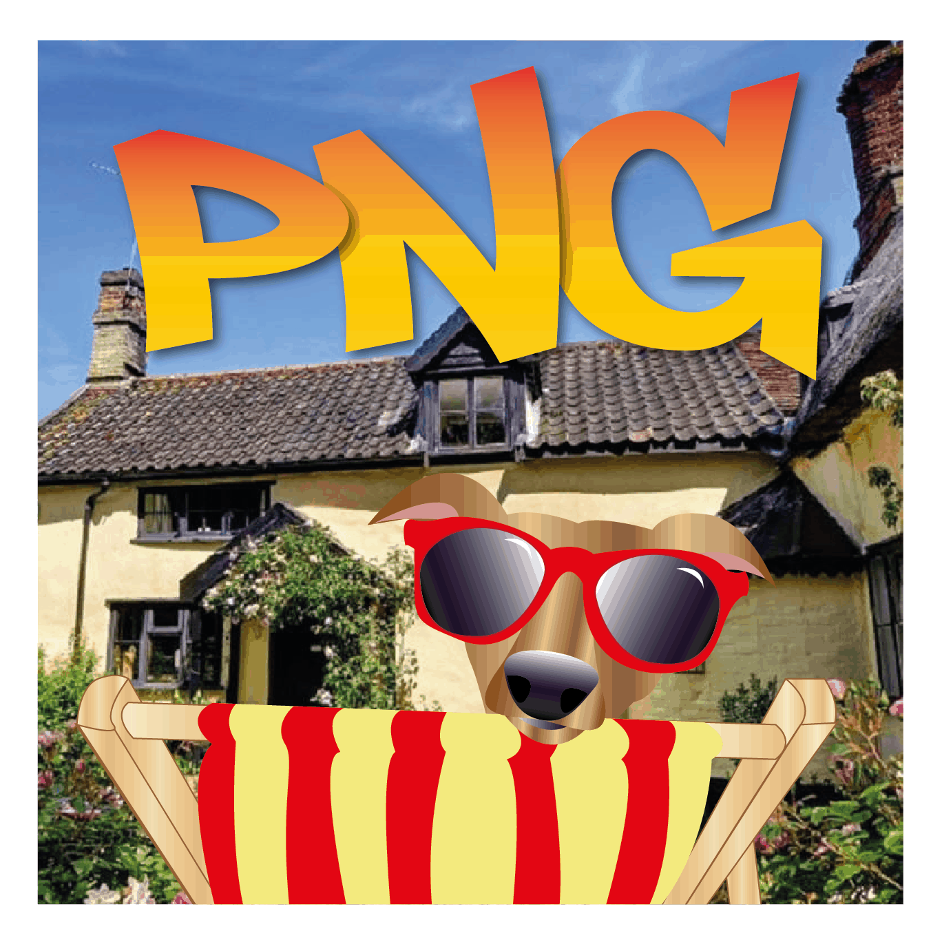 The transparent background shows up as a grey checkerboard when you save the graphic, but when it is reproduced the checkerboard disappears completely!
See the holiday cottage pictures on the right!
PPI
![]()
PPI stands for Pixels Per Inch and is the modern replacement for the outdated DPI (Dots per inch) which, until the advent of modern digital photography and printing, was the industry standard measure of sharpness in a photographic image.
Now designers work digitally on screens we measure in PPI (Pixels per inch) NOT DPI which is a pre-digital printer’s term.
So when you are asked for an image with at least 300 DPI, what they usually mean is 300 PPI.
It’s worth being aware of this difference and to clarify exactly which measurement they are referring to if there is any doubt.
Generally speaking the higher the DPI / PPI the sharper the image.

Primary Colours
![]()
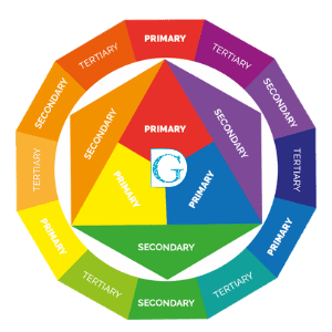 The Primary colours are Red, Blue and Yellow.
They cannot be made by combining any other colours together.
All other colours are created by blending together the primary colours in varying amounts and adding white or black to vary the saturation, tint and tone of the hue.
See Secondary colours and Tertiary colours for more information.
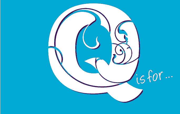
Quill Pen
![]()
This is a bit of a cheat really as there is nothing that springs to mind to include in the glossary of Graphic Design terms that begins with ‘Q’, so we’ve decided to use ‘Quill pen’ as it’s the writing implement that started the art of designing with words.

Rasterized Images
![]()
 When a smooth-edged Vector image or a photograph is saved into a bitmap format (eg. PNG, Jpeg, Tiff) the image is rasterized.
This basically means that the colours and shapes need to be saved as pixels or dots instead to comply with the new file type.
Because the rasterized file will have lower quality resolution than the vector file, sometimes subtleties such as shading can appear altered. Saving at a higher resolution (eg. 300 dpi/ppi or above) will minimise this risk but your file size will be larger as a result.
NOTE: Rasterization is a one-way process, so always save your original as an SVG (Scalable Vector Graphic) file too.
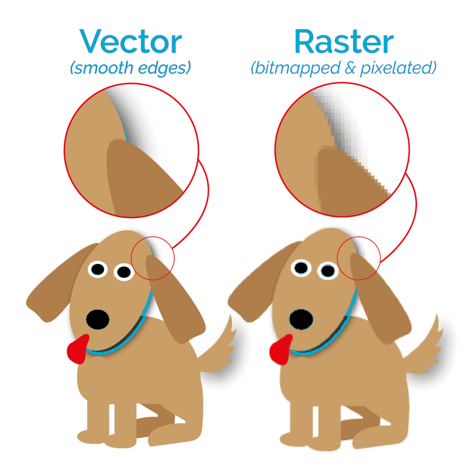
Resolution
![]()
In graphic design and printing, resolution refers to the saved quality of the image or photograph.
Vector images have 100% resolution as they are not pixelated and so these are the best quality images to use if you can.
However, images drawn on non-vector software (e.g., Publisher or PowerPoint) are only able to be saved as bitmaps or rasterized images and this results in pixels of colour replacing the smooth shapes of vector files.
The higher the resolution you save at the better quality the image will be, so 300 DPI/PPI (dots per inch/pixels per inch) is better than 170 DPI/PPI.
Photographs are usually stored as Jpegs with high resolution because photographs are not suitable for saving as vector files but, again, the higher the resolution the better the reproduction of the image will be.
NOTE: Once a vector file or photograph has been rasterized or saved as a bitmap it is irreversible, so always keep a copy of your images in their original non-pixelated formats as well.
Royalty Free
![]()
Sorry, but ‘Royalty Free’ does NOT mean free.
It actually means that the owner of the image or photograph sells the rights to use an image to you for a ‘one-off’ fee - you then can use it according to the seller’s terms and conditions.
You do NOT then own the image or photograph and the seller can sell it over and over again.
Note: It is illegal to copy and paste images off the internet unless the owner has given you permission to do so, and using royalty free images (especially for business purposes) without paying for them is theft.
Do check out who owns the images you are using - even down to your logo (if you had it designed for you, technically the designer own it - not you). Take a look at the information on the Intellectual Property Office .gov.uk
 Also worth noting is that a program called TinEye does ‘reverse image searches’ - making it easy for anyone to see who actually owns an image posted on the internet.
If you feel you might be accidentally using a ‘not-free’ image, it might be worth checking on TinEye before someone else does!
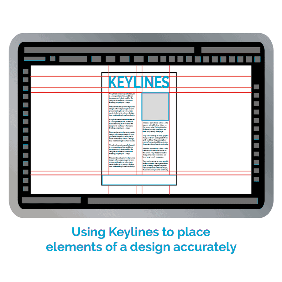
Rule (Keylines)
![]()
A rule (sometimes called a keyline) is a non-printable line, visible on the screen only, that enables the designer to make sure items are lined up properly on a page.
They can be set up in most graphic design software packages to form grids enabling the precise placement of elements within a design, thus maintaining brand continuity and accuracy.
Sans Serif Fonts
![]()
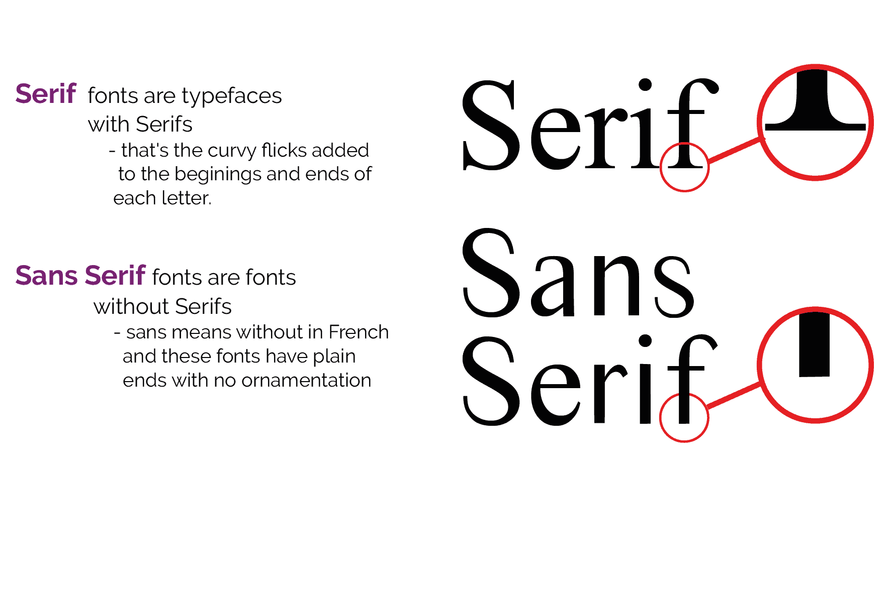 Even though at first glance typefaces may seem to be very similar, typography is one of the most varied areas of graphic design.
Sans Serif typefaces generally look more modern than Serif faces, and there is a huge variety of weights available within most of the fonts eg. bold, medium, light, extra light.
Sans Serif fonts are often paired with more decorative fonts in logos and brand graphics to add visual balance to a design.
Many decorative fonts use existing Sans Serif fonts as a framework to ground the decoration.
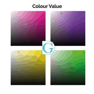
Saturation of Colour
![]()
Saturation including Hue and Value
When designers talk about the SATURATION of a colour they are referring to the purity of the HUE.
HUE is really just another name for colour, but it’s a bit more precise than that.
A HUE (colour) that is at its full 100% strength, with no white or black added, is FULLY SATURATED - in other words, as bright as it can be.
A hue that is less than 100% strength is said to have a low VALUE as the top diagram here shows - going from 100% FULLY SATURATED in the centre to just 1% SATURATION at the edge.
 When a fully saturated colour is mixed with a percentage of another colour or black, the hue becomes MUTED.
As you can see in the diagram on the right, new HUES are beginning to form as the basic colours are muted by the addition of a new colour.
As you can see, colour is so much more than the shades we can name, and when it comes to graphic design colour HAS to be reproduced EXACTLY for branding to work.
So when designers talk about HUE, SATURATION and VALUE it’s not enough to say red or turquoise or pale yellow or murky green.
Thankfully there are ways to pinpoint colours exactly!
See the page called Hex Colour Coding for more details.
Secondary Colours
![]()
The Secondary colours are Violet, Green and Orange.
They are made by combining equal amounts of two adjacent primaries together.
Red + Blue = Violet
Blue + Yellow = Green
Yellow + Red = Orange
On the colour wheel, they are positioned exactly halfway between each of the three primary colours.
For more information on the colour wheel see Primary colours and Tertiary colours.
Serif Fonts
![]()
Even though at first glance typefaces may seem to be very similar, typography is one of the most varied areas of graphic design.
Serif typefaces are particularly suitable for long passages of text, such as in brochures or booklets as the serifs provide a horizontal reference along the baseline which makes it easier for the reader.
Serif fonts convey a sense of authority and gravitas and are often chosen in logos for professions who want to communicate these values to their target market.
Scripts and some decorative fonts also fall into the Serif category.
Split Complementary Colours
![]()
 Split complementary colours combine hot and cool colours to create vibrancy and energy.
As with actual complementary colours, be aware that sometimes a visual ‘vibrating’ effect can occur between these colours - if this is a problem, try lightening or darkening the hue to sort it out.
To generate this pallet, start with the main colour of your choice, and then combine it with the two colours on either side of it, the complementary colours indicated in the diagram on the right.
 Eg. Violet + Yellow-orange + Yellow Green
or Red + Yellow Green + Blue-green
Square Colours
![]()
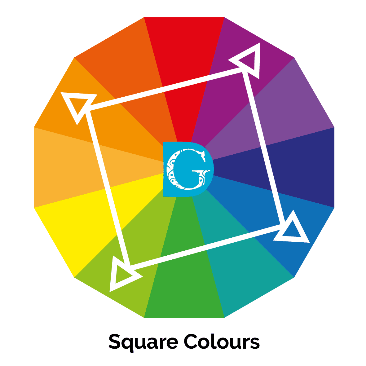 Square Colours are a group of four colours from the colour wheel that comprise any four pairs of colours, as shown in the diagram.
Square colours can be jarring if used together at full saturation, but if used skilfully, e.g., by adjusting the saturation of the colours or adding black and/or white to the colour scheme, they can be very effective indeed.
E.g., Orange + Red-Violet + Blue + Yellow-Green
or Red + Blue-Violet + Green + Yellow-Orange etc.
Related Terms:
 Primary colours, Secondary colours, Complementary colours, Saturation, Analagous colours, Tertiary colours, Triadic colours, Value.
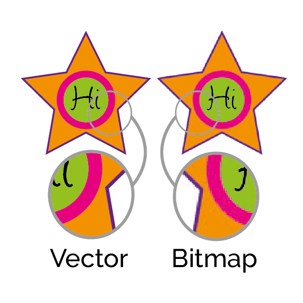
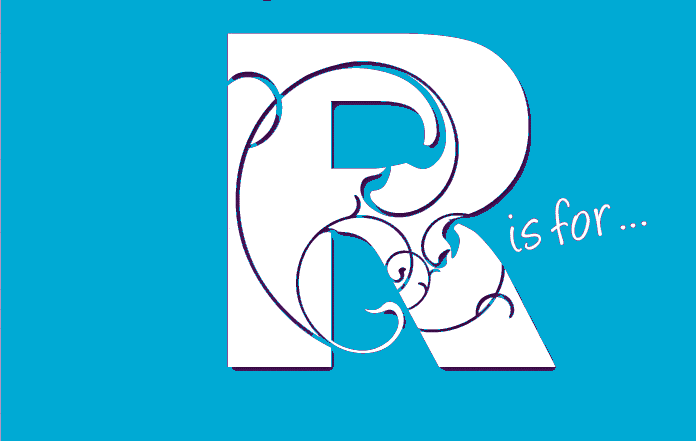
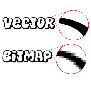
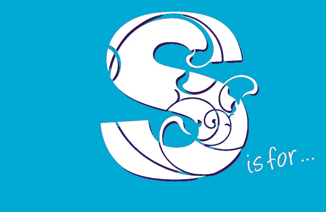
SVG - Scalable Vector Graphics
![]()
SVG stands for Scalable Vector Graphics and it’s obvious to see why it’s preferred by professional graphic designers. Well, obvious to us so I’ll explain!
Vector graphics stay smooth however much you increase or decrease the size of the artwork. This means a logo or graphic designed for a business card can be scaled up with no loss of quality to appear on a 7ft banner and can also be used on the web.
The diagrams below show up close the difference between state of the art vector graphics and old style bitmap graphics, which need to be redrawn for each size and application.
Related Terms: Bitmap Graphics, Vector Graphics, Raster Images, Photos.
Tail
![]()
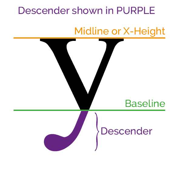
In typography, the descending part of a letter, which in handwriting would finish the pen stroke, is referred to as the tail.
The tail, is one of a letter’s extenders and can descend below the baseline or rest on it, and is sometimes decorative but not always.
In a typeface, the style of the tail is very often a defining feature of the font.
Related Terms:
Baseline, Descender, Midline, Cap Height, Kerning, Leading, Sans Serif Fonts, Serif Fonts, Decorative Fonts, Weight, X-Height.
Tertiary Colours
![]()
Tertiary Colours are the colours created when PRIMARY COLOURS (Red, Yellow & Blue) are mixed with the SECONDARY COLOURS next to them on the colour wheel (Orange, Green & Violet) to form new tertiary colours which are Red-violet, Blue-violet, Blue-green, Yellow-green, Yellow-orange and Red-orange.
Tertiary colours are sometimes also called Intermediary colours.
Related Terms:
Colour Wheel, Primary colours, Secondary colours, Complementary colours.
Tetradic Colours
![]()
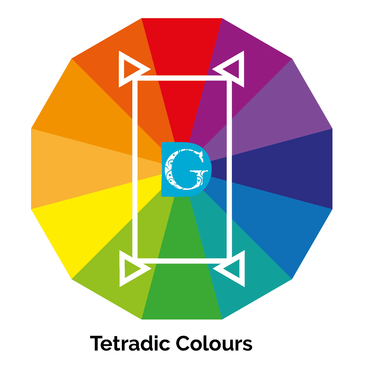 Tetradic (or Rectangular) Colours are a group of four colours from the colour wheel that comprise any four pairs of complementary colours as shown in the diagram.
Tetradic colours can be used to great effect especially if you change the saturation of the colours or add black and/or white to the colour scheme.
Eg. Red Orange + Red Violet + Yellow Green + Blue Green
or Red + Violet + Yellow + Green etc.
Related Terms:
Colour Wheel, Primary colours, Secondary colours, Complementary colours, Tertiary colours, Square colours, Triadic colours.
Triadic Colours
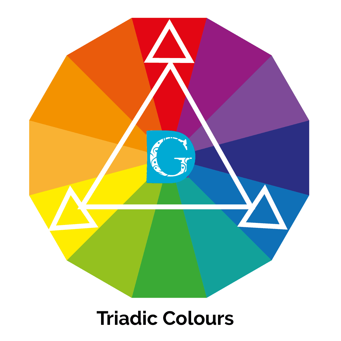 Triadic colours (also called Triads) are groups of 3 colours separated by 120 degrees on the colour wheel.
E.g., Red + Blue + Yellow
or Red violet + Blue green + Yellow orange.
 Once you have chosen your triad, you can then vary the intensity of the colours by using different saturations to make lighter shades to add interest to the graphic, as shown in Mewsli the cat’s mat where a 50% saturation of blue has been used.
Related Terms:
Colour Wheel, Primary colours, Secondary colours, Complementary colours, Tertiary colours, Square colours, Tetradic colours.
Typography
Typography just means designing with type.

It does not have to be flashy or complex like this example:
In fact, the most effective typography is often very simple
e.g., the Google logo
![]()
However, typography comes with a built-in ‘language’ and ‘rules of thumb’ which can trip up the non-professional designer.
The related design terms shown here will tell you more about these in an easy to follow format. Here’s a quick example of Curved Text.
Related terms: Font, Serif, Sans Serif.
Uncoated Paper
![]()
Uncoated Paper is paper that has no coating applied to it.
Standard A4 printer paper is an example of an uncoated paper.
Examples of coating could be glossy, matt, smooth, or velvet.
However, there are some really lovely uncoated papers available with some beautiful textures, so don’t just go for coated paper if you want to make something look really special, such as invitations or cards.
Upper Case
![]()
Upper case lettering, also called capital lettering, is the opposite to lower case lettering.

 The term refers to the way that type was stored in the early days of printing when each font (style of letter) was stored in wooden cases.
The capital letters of each font were stored in the upper part of the case (hence upper case) and the non-capital letters stored in the lower part.
Related Term: Lower case
Value
![]()
A colour’s value in graphic design terms is a measurement of how light or dark a hue (colour) is when mixed with black or white.
The squares here show a value map for pink, purple, yellow & green.
The small circles on the value maps pinpoint a particular value of the colour – move more to the top right and the colour’s value is fully saturated (pure), more to the top left and the value becomes lighter as more white is mixed with it.
Moving down the square adds a percentage of black to the values along the top edge giving a darker shade of the colour.
Adjusting the value of a colour is a good way to add interest to your designs while sticking to your chosen colour pallet.
Vector Graphics
Instead of using pixels to represent images, vector graphics use lines and shapes based on mathematical equations.
Because they don’t rely on pixels VECTOR graphics remains smooth however much you enlarge the image, but a BITMAP version, that is made up of pixels, will quickly become unusable.
Because of this bitmaps have to be re-sized for each use.
With Vector Graphics you are able to draw your logo just once and then re-use the same image file for a business card, a 7ft banner or your website header with no loss of quality AND no extra time or costs involved!
This is not to say that BITMAPS should never be used, in fact, they are great for photographs, but for a truly professional result, they should be combined with VECTOR graphics.
Related Keywords: Bitmap, Rasterize
Watermark
![]()
 A watermark is the ‘ghostly’ writing that appears on graphics or photographs you have to pay for.
You can see our ‘BYOGD’ watermark on all our images before you purchase them and receive the version without a watermark.
The watermark is put there to protect the owner’s intellectual property and prevent you from using the image until the watermark is released.
As with ‘Royalty Free’ images, the owner of the artwork or photograph sells the rights to use an image to you for a ‘one-off’ fee. He or she will then release the watermark and send you the image and you can then use it according to the seller’s terms and conditions.
You do NOT own the image or photograph and the seller can sell it over and over again.
Note: It is illegal to copy and paste images off the internet unless the owner has given you permission to do so, and using watermarked images (especially for business purposes) without paying for them is theft.
Do check out who owns the images you are using - even down to your logo (if you had it designed for you technically the designer owns it - not you) Link to the Intellectual Property Office .gov.uk.
Also worth noting is that a program called TinEye which does ‘reverse image searches’ - making it easy for anyone to see who actually owns an image posted on the internet.
If you feel you might be accidentally using a ‘not-free’ image, it might be worth checking on TinEye before someone else does!
Weight
![]()
In graphic design, weight refers to the thickness of a line wherever it occurs.
This can be in type, where many typefaces come in different weights, but also when you are designing you can adjust the weight of the lines you are using as well.

Line weight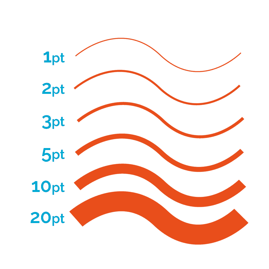
White Space
![]()
White space is a term used by designers to describe areas within a design or on a page where there is just blank space with no words or illustrations in it at all.
The correct term for this is actually Negative Space because White Space does not have to be white, but it does have to be empty.
Professional designers know the importance of leaving plenty of negative space in a design, and non-professionals do tend to give the game away by trying to cram too much onto a page at once.
Just as it is important to be aware of how elements of the design are aligned and work with each other, it is also important to be aware of the effect of the negative space on the overall design as well.
In the examples below, you can see how the negative space on each of the first 4 brochure covers is working to draw attention to the graphics and gives a sense of quality to the cover.
It is also apparent that in image 5, the negative space is fighting the design resulting in a bad layout.
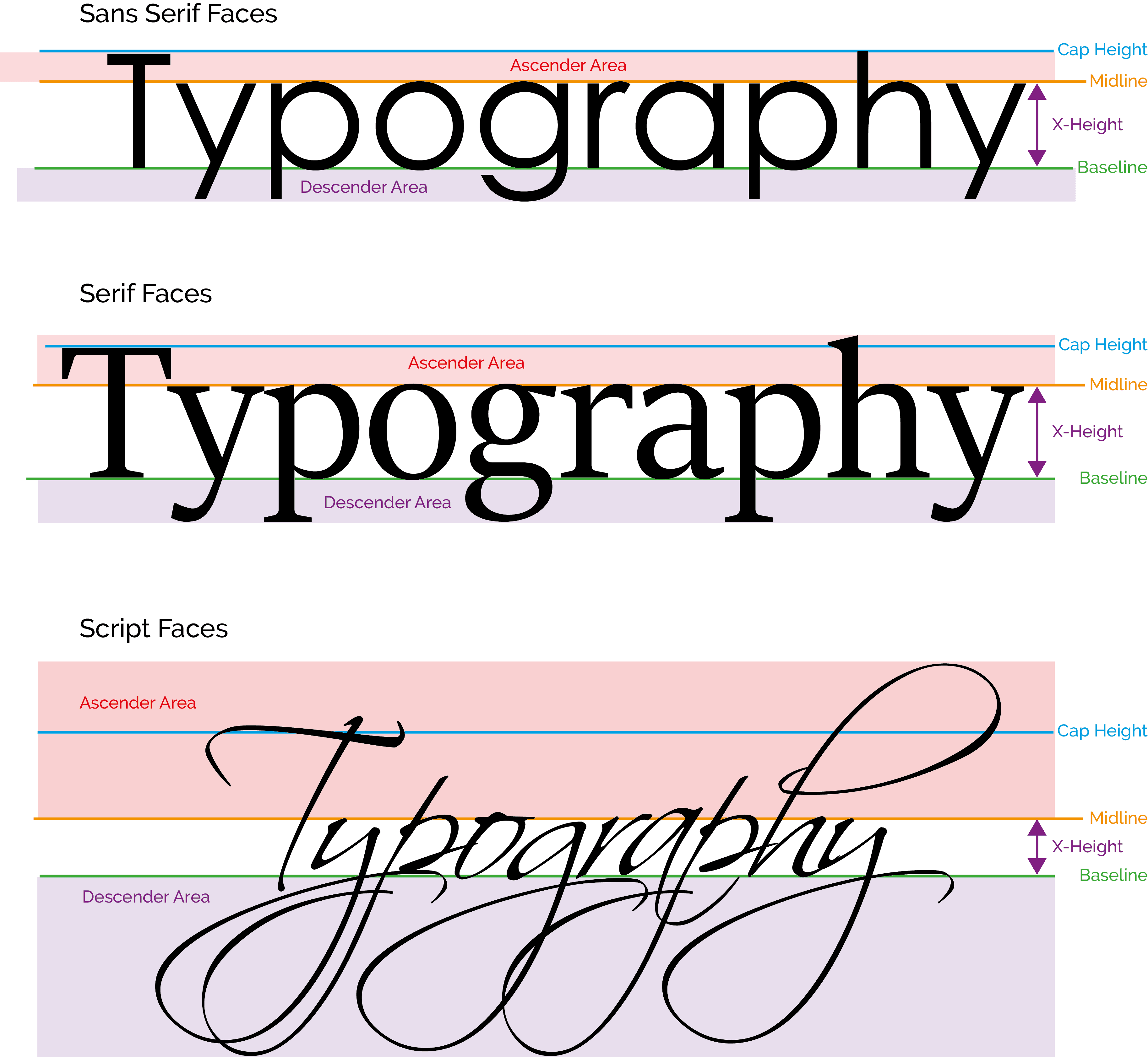
X-Height
![]()
 Typography has a language all of its own which can easily confuse the non-designer.
The X-HEIGHT is measured from the BASELINE to the top of the flat-topped lowercase letters – with the ‘x’ being an obvious example.
Letters with rounded tops at the X-HEIGHT extend a little above the MIDLINE which is more pleasing to the eye and appear inline when read.
Related Terms: Baseline, Midline, Cap Height, Ascender, Descender, Kerning, Leading, Sans Serif Fonts, Serif Fonts, Decorative Fonts, Weight.
Yellow
![]()
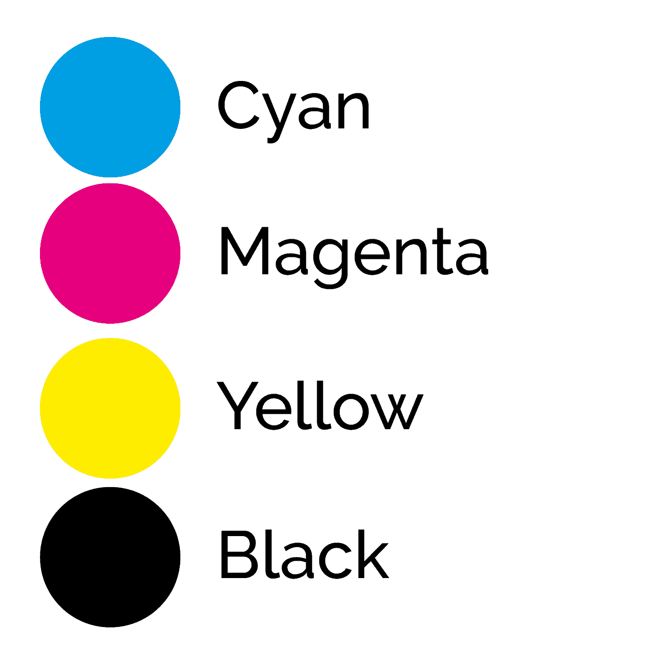 Yellow is one of the colours in the CMYK printing process.
CMYK stands for Cyan, Magenta, Yellow and Black and is also known as a Four Colour Process printing.
Yellow is a primary colour and is the complementary colour of violet.
Its Hex code is #FFFF00
For those of you who would like to read about Yellow in more detail, I have provided a link to Wikipedia’s Yellow page which has lots of technical info on it!
You!
![]()
Yes, really!
You are the most important element in the Graphic Design mix.
Whether you choose to go with a design firm or decide to become your own graphic designer without you your ideas will never become real, the designs in your head will never be designed, the promotional campaigns and social media interaction you would love to instigate will never happen.
Never doubt that you are the key person in your business.
Make sure your branding reflects your ideas, your personality, your business aspirations and your vision.
Be unique - Be yourself!
Zip File
![]()
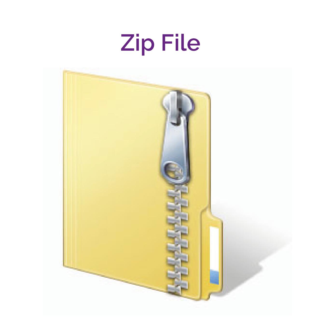 A zip file is a way of compressing files into a smaller format for sending over the internet.
It stands for Zone Information Protocol and is really easy to save images, send them and re-open at the other end!
Zoom
![]()
Zoom is a computer term for enlarging a graphic while it is on the screen to enable you to see a specific area in more detail.
Of course, it is also just as easy to zoom out!
The diagram on the right demonstrates the difference between smooth vector graphics and ragged bitmap graphics.

Choose a Pay-As-You-Go, monthly or annual subscription.