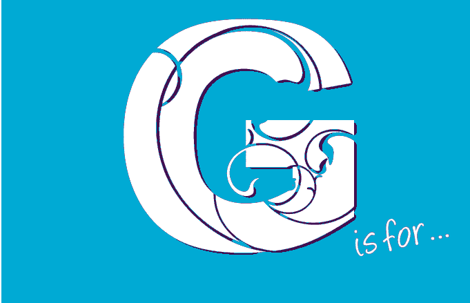
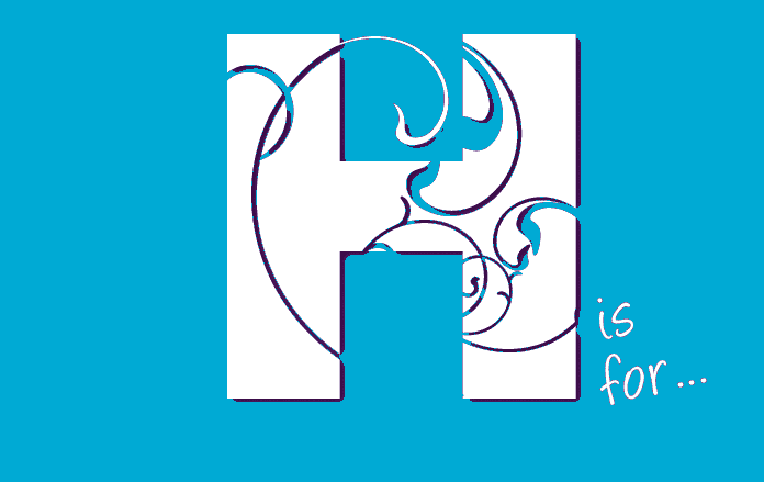
A-Z of Design Terms for Non-Graphic Designers
A to M
Do you ever feel a little confused and out of your depth when talking to graphic designers and printers about what you need - the design terms they use?
Every industry, business and profession has its own language and that language can leave you feeling confused and result in lots of misunderstandings.
Well, here is a little present from us to you to guide you through the jargon.
From Alignment to Zoom you will be armed with the words you need.
Complete with full colour illustrations, the A-Z of Design Terms for Non-Graphic Designers will help you understand those technical terms so you can be confident that you are getting the most from your designer.
So now when you’re stuck and not sure what someone is talking about, you’ll have somewhere to go to look up the information.
You should find our Glossary useful whether you’re becoming your own graphic designer or dealing with a graphic designer or printer.
You can even download your own PDF version by subscribing below.
A Sizes
![]()
In the UK the standard size used to measure paper is the ‘A’ system.

When you are designing on your computer you will notice lots of other sizes such as legal and letter but if you are designing in the UK, stick to the A sizes!
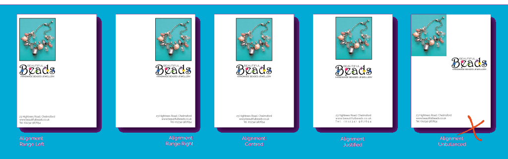
Alignment
![]()
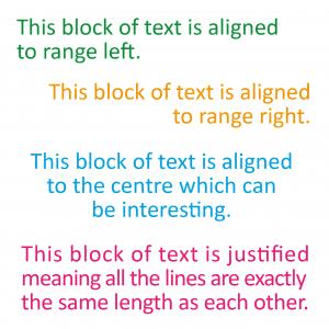 Alignment is key to good graphic design.
In its most basic form, alignment can be:
Range Left
- Everything aligned vertically to an imaginary straight line on the left. This is the usual format for large blocks of text as it makes reading easier.
Range Right
- Everything aligned vertically to an imaginary straight line on the right. This can look really stylish but is best reserved for smaller sections of text as the ragged left-hand edge can make reading large quantities of text difficult.
Centred
- Everything aligned vertically to an imaginary straight line in the centre. This is ideal for addresses at the bottom of pages or simply to achieve a really balanced and symmetrical look.
Justified
- Everything is aligned to fit exactly between two vertical lines. One ranged left and one ranged right. The kerning (space between the letters) has been adjusted to make the left AND right sides vertical. This is often used for a large amount of text, as in leaflets, brochures and books as it keeps things neat and aids reading.
- A word of warning - it rarely works well on short pieces of text as the words start to look very odd indeed!
Alignment is also about creating a visual balance between design elements on your page
Analogous Colours
![]()
An analogous colour pallet is created when any three adjacent colours on the colour wheel are used together.

Examples include:
Red orange + Red + Red violet
or Yellow + Yellow green + Green etc.
Remember that you can vary the colours by decreasing the saturation of the colours to create tints.
On the example of Mewsli the cat, the square background is a 60% tint of the yellow in the pallet.
Related Terms:
Primary colours, Secondary colours, Complementary colours, Saturation, Triadic colours, Square colours, Tertiary colours, Tetradic colours.
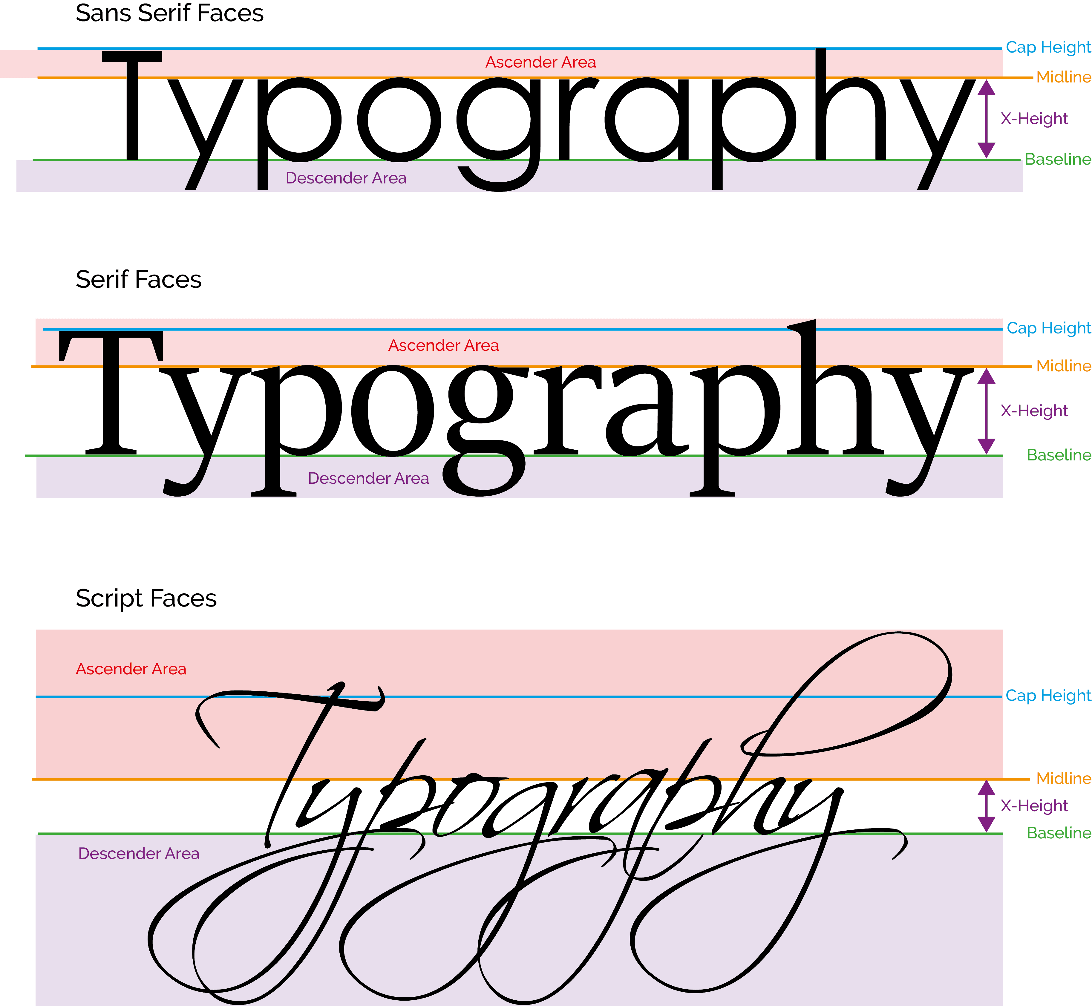
Ascender
![]()
Typography has a language all of its own which can easily confuse the non-designer.
The ASCENDER is the part of any letter that extends above the CAP HEIGHT and is often the defining element in many SERIF, SCRIPT and DECORATIVE typefaces.
Be careful not to overuse typefaces with large ASCENDERS and DESCENDERS as they can get visually tangled!
Related Terms: Baseline, Descender, Midline, Cap Height, Kerning, Leading, Sans Serif Fonts, Serif Fonts, Decorative Fonts, Weight, X-Height
Baseline
![]()
Typography has a specific language all of its own which can easily confuse the non-designer.
The BASELINE is the imaginary line upon which the words rest and is shown as the GREEN line here:
It is the line from which elements of type such as X-Height and leading are measured.
It can also be curved or wavy!
Related Terms: Ascender, Midline, Cap Height, Kerning, Leading, Sans Serif Fonts, Serif Fonts, Decorative Fonts, Weight, X-Height
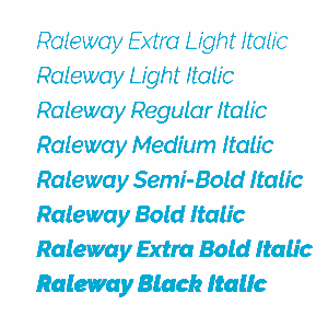
Bold Typeface
![]()
Many typefaces come in families centred around a ‘Medium’ or ‘Regular’ style.
A family of typefaces could include up to 7 or 8 variations of ‘weight’ as demonstrated here.

Bold Type
Bold type is a great choice to make for headlines, headers, call to action banners and attention-grabbing starbursts!
Using vector graphics software it is possible to make a regular typeface bolder by adding an outline to it, but it’s better to try to find a typeface you like which already has a bold variant if you can.
It is a very good idea to choose a basic typeface with a variety of weight variations when you are deciding on your branding elements, as this will give you a choice of weights without changing the actual typeface and therefore more options to choose from.
See also Italic Type.
Borders
![]()
Adding a border to a whole design layout or to separate elements within a layout can really focus attention and pull a whole design together.
If you choose to use a border, make sure you select one that compliments the overall style and feel of your work.
There are many borders to choose from, or indeed you can design and use your own, but don’t get too carried away.
However beautiful they are, more complicated, brightly coloured and thicker borders can often overwhelm the design elements and steal attention.
A great way of avoiding this is to make the border a tint (paler) or tone (darker) of one of the main colours in the design.
Branding
Branding is so much more than just a logo.
Way back in the distant past, human beings developed a visual survival skill that allowed them to instantly determine the difference between plants and animals that were good to eat and those that were likely to kill them.
Over millions of years, we have refined those skills and now make sub-conscious associations automatically based on visual stimuli all the time.
Branding your business is the science of getting your company values and associations linked to a particular visual stimulus ( ie. your logo and associated branding), in the heads of your target market.
Defining you Brand
1. Your Logo should
- Be unique and different from that of any of your competitors
- Have your company name on it
- Be memorable
- Be simple
- Create credibility with your target market (e.g., a logo for a rock band would need to look different from a logo for an accountancy firm and vice versa in order to have credibility with their respective target audiences!).
2. Associated Branding
- Choose one main typeface to use for all of your information and blocks of text
- Choose a secondary typeface to use for headlines and highlights
- Choose a set of colours that you will always use - refer to your logo for these
- Choose a ‘house style’ for your work that encompasses your logo, business cards, website, leaflets etc.
3. Be Consistent
- Consistency is the key to developing a strong brand
- Familiarity with your house style is just as powerful as familiarity with your logo
- Use your house style on everything you produce under the name of your business
- Look after your brand and it will look after you!
4 C's of Graphic Design
![]()
Good graphic design should always be CUSTOMER FOCUSED.
1. Who is your CUSTOMER?
Define who you’re targeting as precisely as possible.
Are you addressing ALL your customers or a sub-section?
2. What is your CONCEPT (idea) for this promotion?
A poster? Social media advert? Brochure? Festival?
What is your Unique Selling Point?
How will you tell your target market about it?
What do you want them to do and when?
3. Which COMPONENTS will you use?
Logo, Strapline, Headline, Event, Offer, Date, Time, Address, Photos, Graphs, Maps, Social media address?
4. Now it is time to begin work on the COMPOSITION!
Remember to choose a style and layout that will appeal to your identified CUSTOMERS (see 1).
Cap Height
![]()
Typography has a specific language all of its own which can easily confuse the non-designer.
The CAP HEIGHT is the distance between the BASELINE and the top of the upper case letters which have flat tops such as T or H and does not include any ASCENDERS – see terms below.
It is shown as the BLUE line here:
Related Terms: Ascender, Baseline, Midline, Kerning, Leading, Sans Serif Fonts, Serif Fonts, Decorative Fonts, Weight, X-Height
Clip Art
![]()
Clip Art is the term given to graphics you can download direct from the internet onto your computer.
Some of the more basic ones you can download for free, but most you have to pay for - especially if you are going to use them for business promotion.
It can be tempting to use clip art because it’s easy and ‘almost’ what you want, but most clip art is easy to spot and can send all the wrong messages to your customers.
Spending a little extra money commissioning a bespoke design, or spending a little extra time to design one yourself, will pay dividends with your customers. Establish your brand style and mark out your promotional work as being a cut above.
Please do not be tempted to use pay-per-download clip art (or stock photos) without paying for the rights to use them, especially if your advertising is likely to end up on the internet, and never be tempted to copy and paste a picture to use in your business without first asking permission from the owner, even if you plan to crop or modify it.
It’s easy to trace who owns images on the internet using a program called TinEye ( https://www.tineye.com) which is a reverse image search engine. It finds out where an image came from, who owns it, how it is being used and if modified versions of the image exist.
Using a search engine like TinEye can save you from making an expensive mistake.
Much better to design or commission your own.
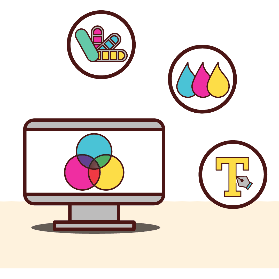
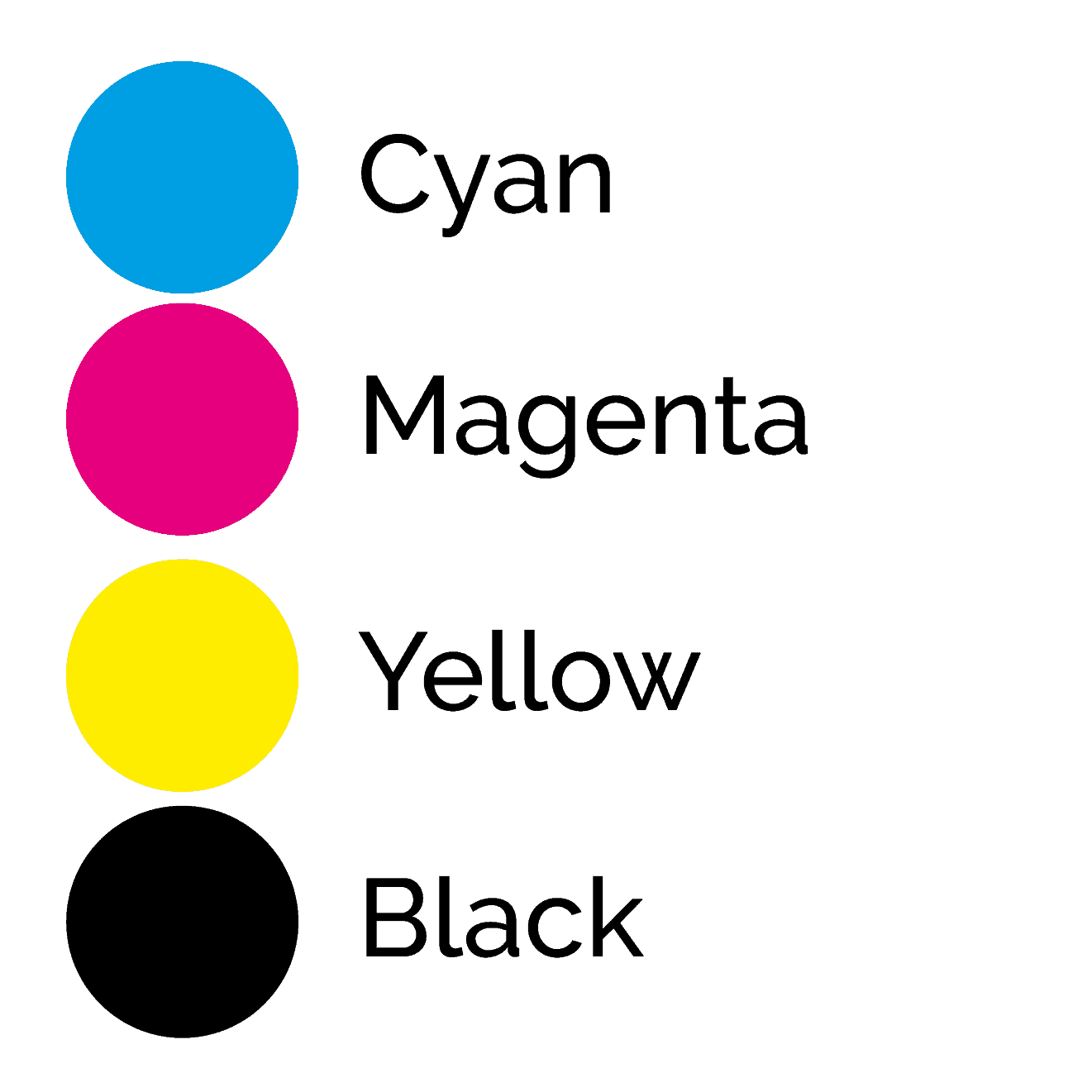
CMYK
![]()
CMYK is a type of printing.
It is also sometimes referred to as FOUR COLOUR PROCESS printing.
The four colours are Cyan, Magenta, Yellow and Black and they are combined to create full-colour images on paper or card.
Put simply, a full-colour image is separated into the 4 different colours (Cyan, Magenta, Yellow and Black) using filters in the graphic design software. This results in 4 separate images which are then printed one by one on top of each other, to build up the image. The order is usually CMYK (the K stands for the blacK - B in graphics refers to Blue).
If you look at CMYK printing under a microscope you will see that the image is made up of thousands of tiny dots which have been printed at different sizes and angles to create the printed image.
It is mainly used for large print runs where it is very competitively priced.
Small print runs are normally better off using digital printing methods.
PS. This page is reproduced under the title Four Colour Process elsewhere in this glossary.
Colour Wheel
![]()
A colour wheel is a circle of 12 colours arranged to show the relationships between primary, secondary and tertiary colours.
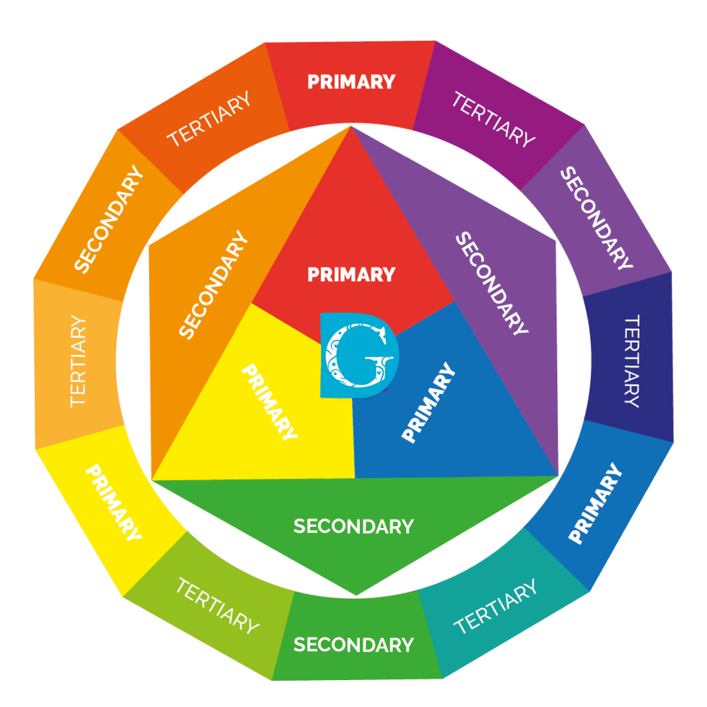
The PRIMARY COLOURS are: RED, BLUE and YELLOW
They are the only 3 colours that can’t be made by combining any other colours.
The SECONDARY COLOURS are VIOLET, GREEN and ORANGE and are made by mixing together pairs of primary colours.
TERTIARY COLOURS are made by mixing adjacent primary and secondary colours together to form a third colour: They are RED-VIOLET, BLUE-VIOLET, BLUE-GREEN, YELLOW-GREEN, YELLOW-ORANGE and RED-ORANGE.
Related terms: Primary Colours, Secondary Colours, Tertiary Colours, Hue
Complementary Colours
![]()
Complementary colours are any pair of colours that appear OPPOSITE each other on the colour wheel.
For example, Red and Green or Blue and Orange.
While complementary colours work well together they need to be used carefully as sometimes a strange optical ‘shimmering’ effect can be produced. A good way to do this is to reduce the saturation (intensity) of one or both colours as shown in the example picture of Mewsli the cat and the mat he is sitting on.
Changing the value (the light to dark variation of the colour) can also really help a complementary colour scheme to work well.
Related Terms: Primary colours, Secondary colours, Analogous colours, Saturation, Triadic colours, Square colours, Tertiary colours, Tetradic colours.
Cyan
![]()
Cyan is one of the colours in the CMYK printing process.
CMYK stands for Cyan, Magenta, Yellow and Black and is also known as Four Colour Process printing.
Cyan is a greenish-blue colour and is the complementary colour of red.
Its Hex code is #00FFFF
For those of you who would like to read about Cyan in more detail, I have provided a link to Wikipedia’s Cyan page which has lots of technical info on it!
Deadlines
![]()
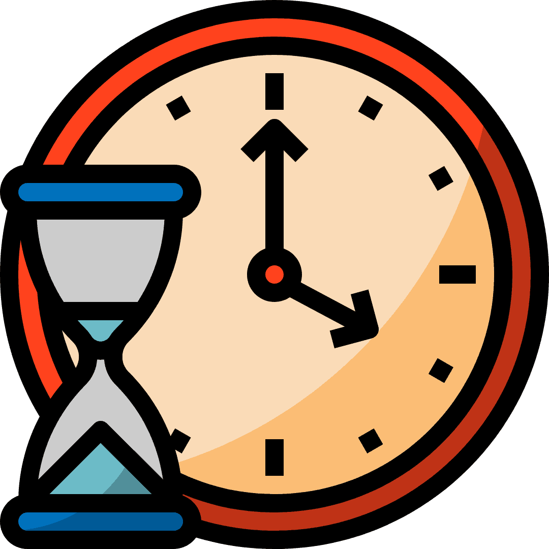 Graphic designers and printers are busy people and your work will have to be scheduled in with all the other work they are doing.
It’s therefore only polite to give them as much lead time as possible before your ‘must-have-finished-by’ date.
Graphic Designers
For example, the usual sequence for a logo design would look something like this:
Week 1: Initial enquiry by you
Week 2: Quote arrives
Week 3: Initial design ideas meeting to establish what you want from your logo design
Week 4: Meeting to look at some rough design ideas and to discuss idea development
Week 5: Meeting to look at a selection of possible ideas now the changes discussed last week have been made
Week 6: Normally you will be presented with a selection of 3 logo proofs to choose between.
If further changes or tweaks are needed add on another week or two!
So, as you can see, it’s important to leave enough time for your designer to do their job!
Printers
 Printers can usually turn jobs around very fast indeed, especially if you’re going for digital printing.
It’s best to allow about 10 days, but many printers can turn jobs around and have the work printed and delivered to you within 3 or 4 days.
Decorative Fonts
![]()
Decorative fonts can be great fun, but be careful not to overuse them.
They are a fantastic addition to themed events and can really make your event stand out from the crowd!
There are literally hundreds of decorative fonts available to download from the internet but please do make certain that you are allowed to use them for free before just assuming this is OK.
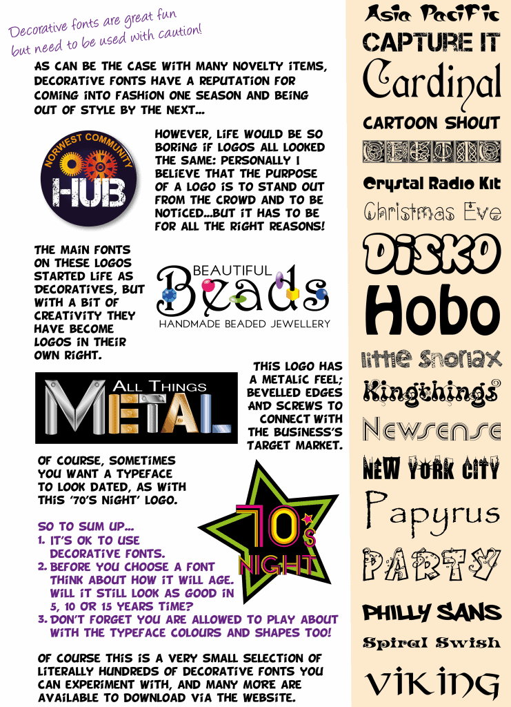
Related Terms: Ascender, Baseline Midline, Cap Height, Kerning, Leading, Sans Serif Fonts, Serif Fonts, Weight, X-Height
Descender
![]()
Typography has a language all of its own which can easily confuse the non-designer.
The DESCENDER is the part of any letter that descends below the BASELINE such as the tails on y, g, p and q.
In some fonts, letters such as k and r have tails that descend below the line too.
Related Terms: Ascender, Baseline, Midline, Cap Height, Kerning, Leading, Sans Serif Fonts, Serif Fonts, Decorative Fonts, Weight, X-Height.
DPI
![]()
DPI stands for Dots Per Inch and is an industry-standard measure of sharpness in a photographic image.
Technically though, it is an out of date term because now designers work on screens we measure in PPI (Pixels per inch) NOT DPI which is a pre-digital printer’s term.
So when you are asked for an image with at least 300 DPI, what they usually mean is 300 PPI.
It’s worth being aware of this difference and to clarify exactly which measurement they are referring to if there is any doubt.
Generally speaking the higher the DPI / PPI the sharper the image.
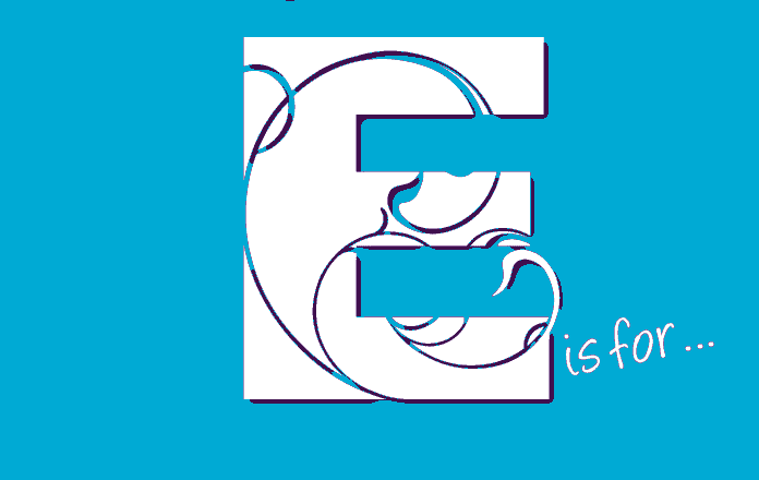
Element
![]()
Designers refer to an object or group of objects in a design as an ‘element’ of that design.
So individual elements in this design would be:
- Header
- Photo
- Bullet points
- Logo
- Background image
- Call to action
- Contact details
Emphasis
![]()
Put simply, in graphic design terms, emphasis is making something stand out from everything else on the page.
The task for the designer is to choose how to make the most interesting or important element stand out sufficiently to draw the attention of potential customers, without distracting from the rest of the design and the information it contains.
This can be achieved through size, boldness, colour, shape or outline but must be balanced within the whole design to be effective.
Be very aware of the problem which occurs when too many things try to have emphasis in a design as this results in a similar situation to that found in a room where everyone is shouting at the same time. Nothing will stand out at all and the message is unlikely to be ‘heard’.
EPS
![]()
 EPS or Encapsulated PostScript is a graphics file format that is used to transfer PostScript documents that contain images which are within another PostScript document.
This is quite technical but don’t worry too much about the detail - just think of it as another file format.
Any good design program will be able to save to EPS and read files that come in in that format too. EPS files are typically created and edited in illustration programs such as Adobe Illustrator or CorelDRAW.
Export
![]()
 In graphic design terms, when you EXPORT a design you are saving it into another file format.
If I work on a design in SVG (Scalable Vector Graphics) format but need to have it in a PNG (Portable Network Graphics) format, for posting on social media, or as a PDF (Portable Document Format), for sending to a printer, I need to EXPORT the file into that format.
It sounds very technical but any good graphics program will be able to do this for you at the touch of a button.
No worries!
Eye Flow
![]()
Eye flow refers to the path a reader’s eyes take when looking at a piece of graphic design work, whether that be a logo, leaflet, advert or webpage.
A good design should have a definite starting place for the eye to rest on, and then lead the viewer’s eye flow from area to area, in the order the designer has pre-decided for them.
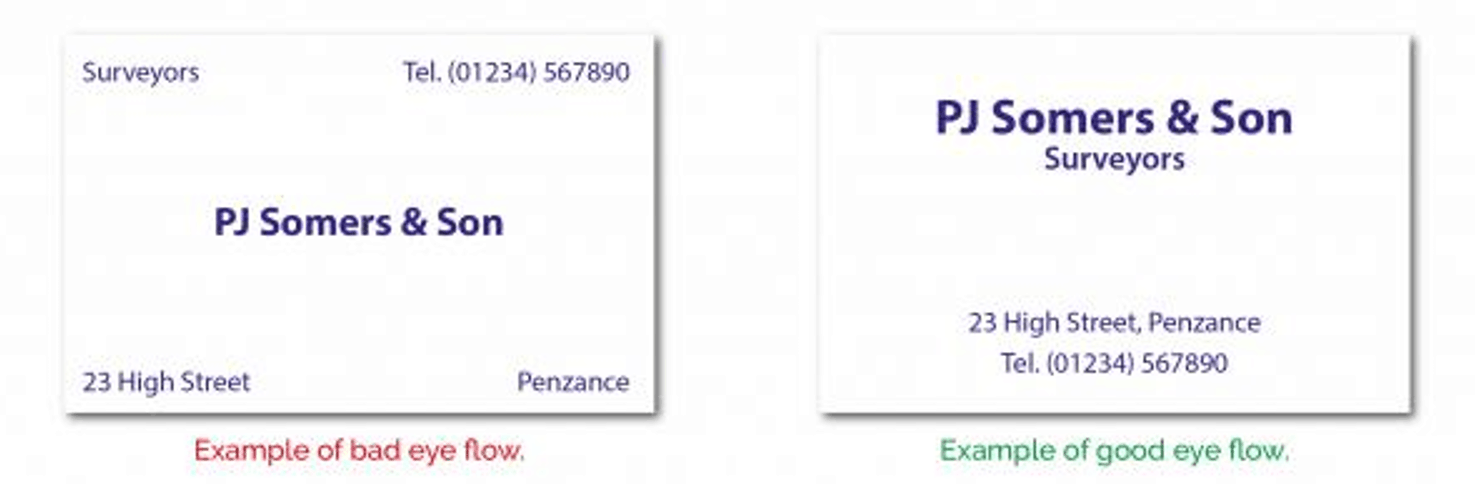
When designing for yourself, always be aware of how your eyes move around the page. If you don’t know where to go next, or think you may have missed a piece of information on the page, the design is not good.
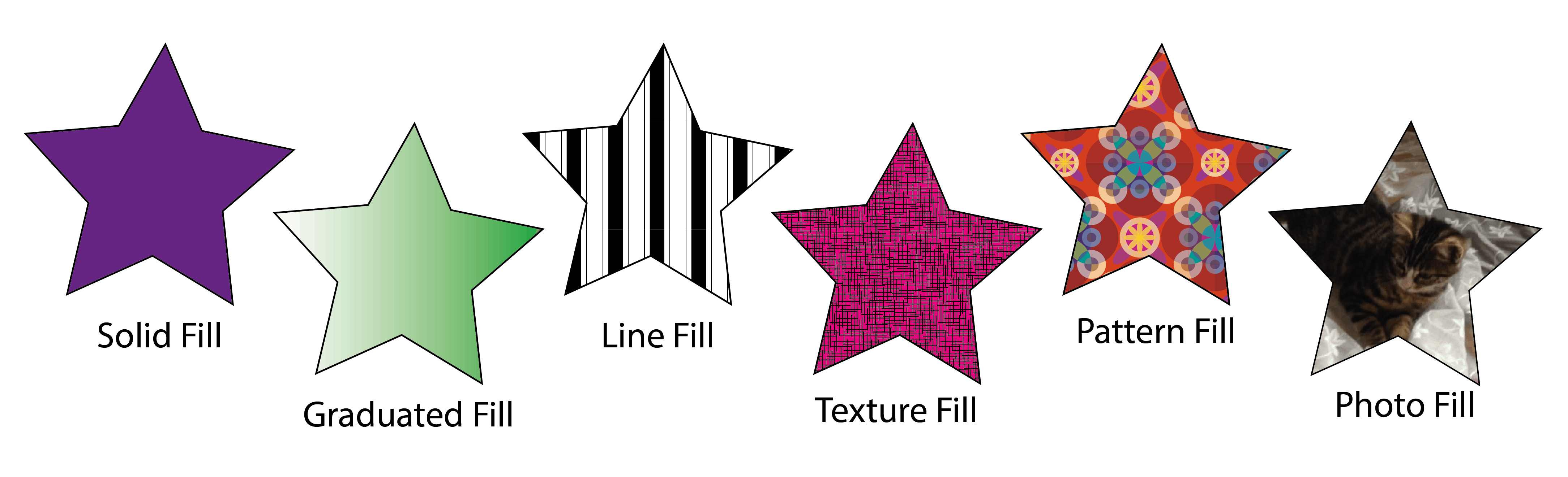
Fill
![]()
Fill refers to the colour, gradient or pattern that is filling an outline or shape.
The Fill Tool appears as a Paint Can icon in most graphic design programs.
Flyers
![]()
A flyer is simply a printed sheet of paper, usually A5 or A6 in size, that is handed out to advertise or announce a product, service or event.
Flyers often form part of the untargeted junk mail that arrives on our doorsteps daily - so if you are planning a flyer campaign, do make sure you target it properly or you could find most of your flyers are ending up unread in the bin.
In recent years, flyers are also posted in electronic form on social media and special interest sites to advertise directly to a specific target market.
Font
![]()
Font is just another word for a particular size, weight and style of a typeface.
The word dates back to the beginning of printing when letters were cast out of metal, (font meaning ‘casting’ in Middle French).
Today we have literally hundreds of fonts to choose from, many of which are available for free as internet downloads.
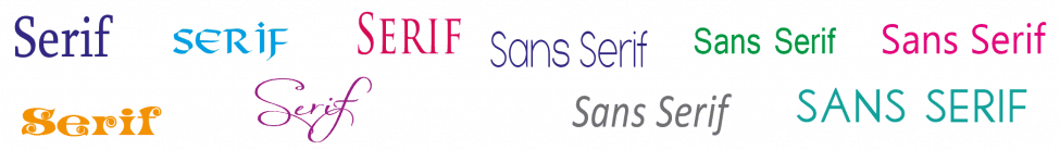
For more detail on fonts and their uses, please refer to sections on:
- Sans Serif Fonts
- Serif Fonts
- Script Fonts
- Decorative Fonts
Where you will find hints, tips and some examples too!
Four Colour Process
![]()
Four Colour Process is a printing term.
It is also sometimes referred to as CMYK printing .
 The four colours are Cyan, Magenta, Yellow and Black and they are combined to create full-colour images on paper or card.
Put simply, a full-colour image is separated into the 4 different colours (Cyan, Magenta, Yellow and Black) using filters in the graphic design software. This results in 4 separate images which are then printed one by one on top of each other, to build up the image. The order is usually CMYK (the K stands for the blacK - B in graphics refers to Blue).
If you look at four colour process printing under a microscope you will see that the image is made up of thousands of tiny dots which have been printed at different sizes and angles to create the printed image.
It is mainly used for large print runs where it is very competitively priced.
Small print runs are normally better off using digital printing methods.
PS. This page is reproduced under the title CMYK elsewhere in this glossary
Frames
![]()
Frames refers to still ‘frames’ from moving images such as videos and animations or GIF’s.
While video is recorded in real time, and a frame can be created by just pausing the video, an animation or a GIF is made by stringing together a sequence of images which have slight movements.
The eye processes these as movement when they are strung together and the result is an animation.
Walt Disney was the first person to ever produce a full-length feature film animation, Snow White in 1937, and he astounded fellow cartoon makers by insisting on 25 slightly different frames per second to ensure the smooth movements he wanted for his characters. When you consider that EVERY FRAME had to be hand-drawn onto acetate and then hand coloured you can appreciate how much work went into the film.
Thankfully animation is much easier now we have graphics packages to do a lot of the work for us!

Gif
![]()
A Gif is an animated graphic like this little one of Waffle wagging her tail! GIF stands for Graphics Interchange Format which supports animation but is limited to a colour pallet of just 256 colours. This makes GIF an unsuitable format for photographs. The reason for this limited colour spectrum is that the Gif file compresses the multiple images needed to make an animation into a manageable data size without losing visual quality.
For more information see also FRAMES in this glossary.
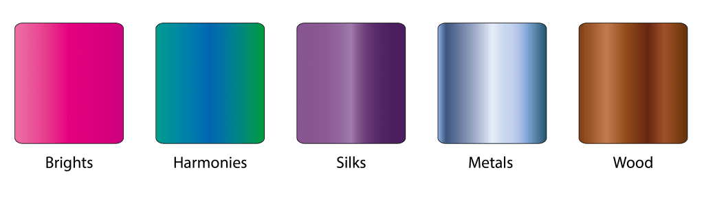
Graduated Colour
![]()
A graduated colour or gradient is a smooth transition from one colour to another.
Vector quality graphic design software allows designers to create an unlimited variety of graduated colour blends to use in their work.
These colour blends can be made to represent other things such as sky, metal, wood or shadows.
Here are some examples:
Graphic Design
![]()
 Graphic Design is the art of combining visual and typographical elements together in order to make a customer respond in a particular way, e.g., go to an event, make a purchase, make an enquiry, do something!
The field is often considered as a sub-set of art, but actually graphic design is a combination of design, visual communication, marketing, psychology and sociology.
Wikipedia defines Graphic Design as:
“The methodology of visual communication, and problem-solving through the use of type, space and image. The field is considered a subset of visual communication and communication design, but sometimes the term “graphic design” is used interchangeably with these due to overlapping skills involved. Graphic designers use various methods to create and combine words, symbols, and images to create a visual representation of ideas and messages. A graphic designer may use a combination of typography, visual arts and page layout techniques to produce a final result. Graphic design often refers to both the process (designing) by which the communication is created and the products (designs) which are generated.
Common uses of graphic design include identity (logos and branding), publications (magazines, newspapers and books), print advertisements, posters, billboards, website graphics and elements, signs and product packaging. For example, a product package might include a logo or other artwork, organized text and pure design elements such as images, shapes and colour which unify the piece. Composition is one of the most important features of graphic design, especially when using pre-existing materials or diverse elements.”
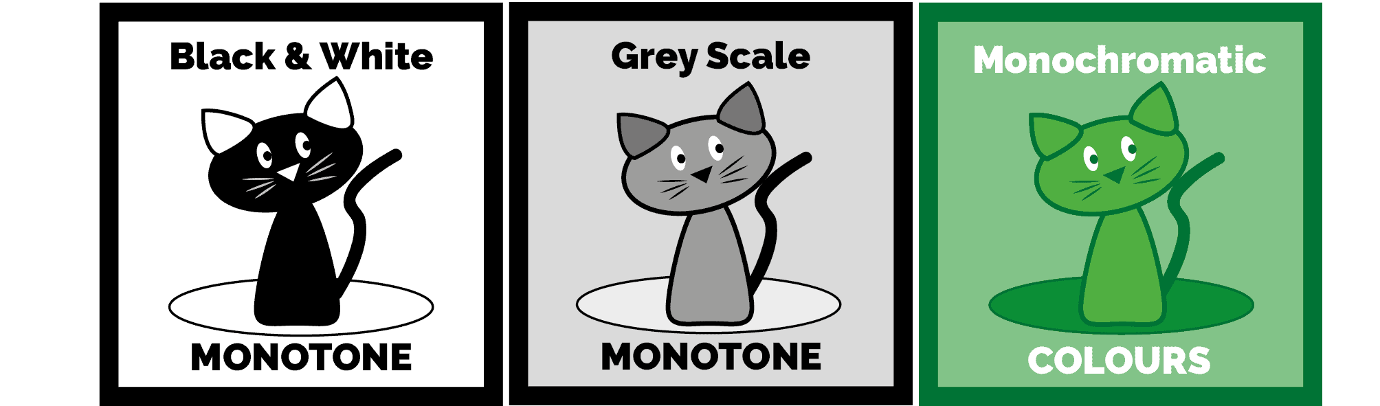
Grey Scale
![]()
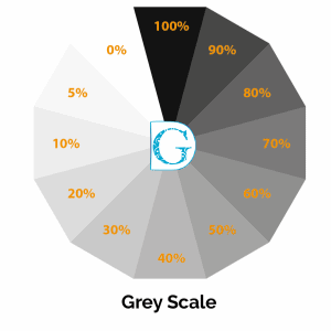
Grey Scale is the term designers use when they are referring to work that will be reproduced using only black as the print colour, but making use of all the greys available by printing tints.
Designers do not refer to this as ‘black and white’ as this implies that the black and white are at 100% saturation with no greys.
 A pallet of tints of just one hue (not necessarily black) is called MONOTONE by the way (not blue scale, green scale or pink scale!)
Grid
![]()
A grid is an arrangement of non-printable vertical and horizontal lines set up on a page to guide the designer and aid in the placement of elements on a page.
A grid can really help to structure a design, especially when the designer is working on a brochure or magazine, where all the pages need to appear related by a common layout.
Hard Copy
![]()
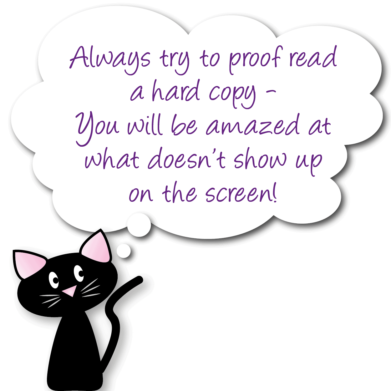 When a design is printed out of a computer graphics program onto paper or card it is called a hard copy, as opposed to digital copy.
It is often easier and more accurate to proofread a hard copy than trying to do the same on a screen, a designer will usually send you a hard copy as your final proof before you sign a job off.
If you are designing for yourself, printing a copy of your final design to look at in hard copy, before you send it to be reproduced or put on your website is well worth the cost in printing ink.
Hex Colour Coding
![]()
Hexadecimal Colour Coding (Hex Codes for short) is the way that hues (colours) are precisely defined by a graphic designer to communicate to others the exact shade, tone, tint and value of colour they want to reproduce.
Using Hex codes it is possible to pinpoint and name 16,777,216 individual colours!
Without going into too much detail a hexadecimal code is a six-digit number used to define precise colours on a computer - most graphic designers will be using either SVG (Scalable Vector Graphics) to design with or HTML (Hypertext Mark-up Language) to build websites, so the Hex system is the most widely used, although other systems are also available.
This is just an example of the 16,777,216 individual colours you can choose from:
So how do you find all the others?
Easy - here is a link to our favourite hex code finder website at w3schools.com.
On this website, you can select any colour you like from the full selection available and it will give you the code - just copy it down and you can be guaranteed to replicate that colour again and again and again perfectly!
Highlights
![]()
Highlights are the lightest part of a photograph or image that are brighter than the rest of the image and therefore catch the eye.

A highlight is often found where light bounces off a shiny or wet object and when used correctly can make images appear glossy and vibrant.
When drawing graphics, designers sometimes add highlight area using graduated whites to give a 3D feeling to an otherwise 2D image.
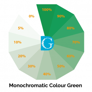
Hue
![]()
Hue including Saturation and Value
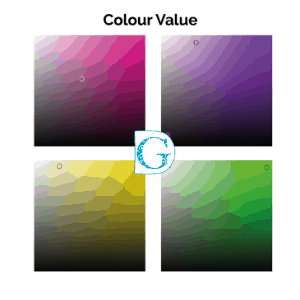 Hue is really just another name for colour, but it’s a bit more precise than that.
A HUE (colour) that is at its full 100% strength, with no white or black added, is FULLY SATURATED - in other words, as bright as it can be.
A HUE that is less than 100% strength is said to have a low VALUE as the top diagram here shows - going from 100% FULLY SATURATED in the centre to just 1% SATURATION at the edge.
When a fully saturated colour is mixed with a percentage of another colour or black, the HUE becomes MUTED.
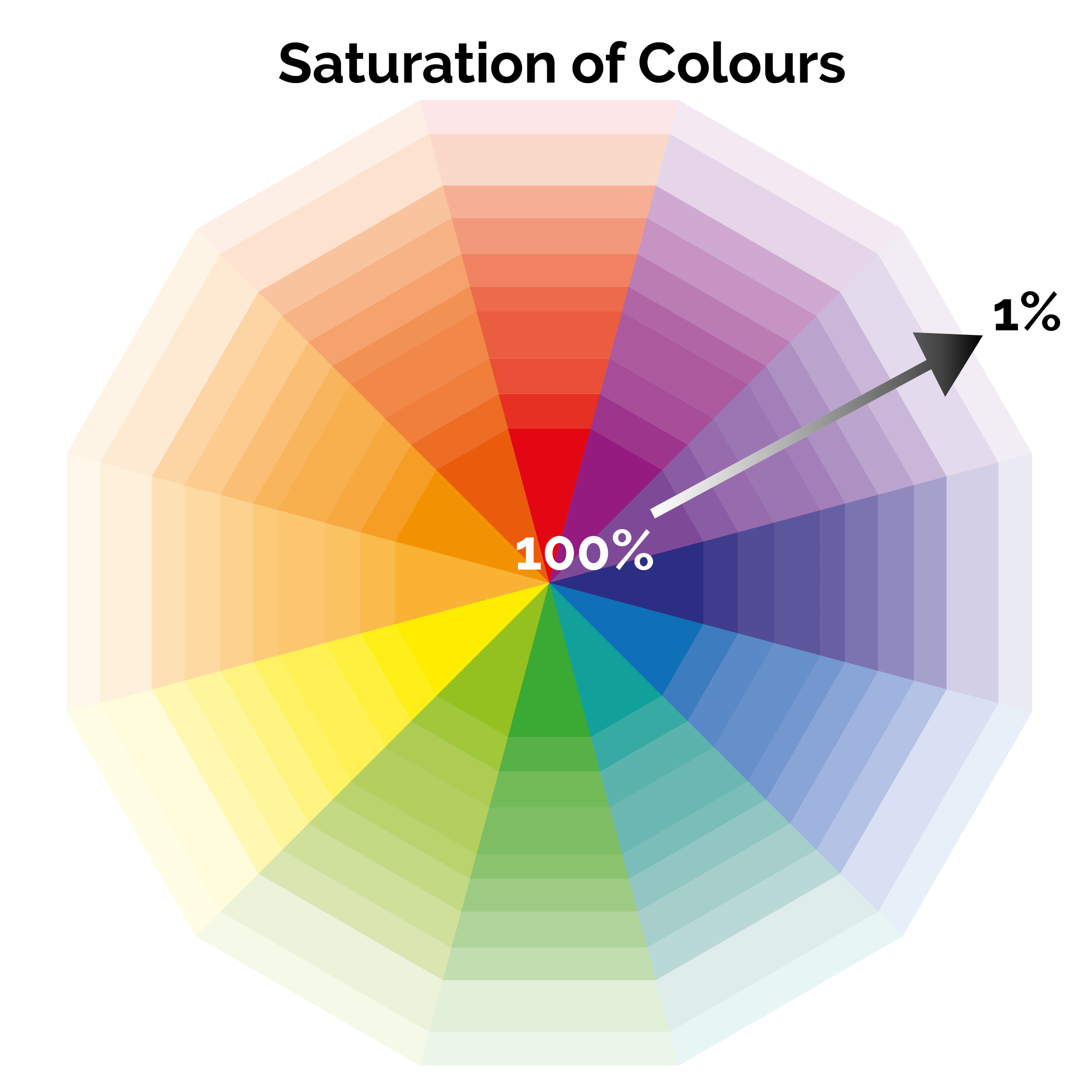
As you can see in the diagram, new HUES are beginning to form as the basic colours are muted by the addition of a new colour.
Colour is so much more than the shades we can name, and when it comes to graphic design colour HAS to be reproduced EXACTLY for branding to work.
So when designers talk about HUE, SATURATION and VALUE it’s not enough to say red or turquoise or pale yellow or murky green.
Thankfully there are ways to pinpoint colours exactly!
See the section called Hex Colour Coding for more details.
Icon
![]()
In graphic design, the word icon refers to a simplified image which stands alone to represent an organisation, action or process and which often appears in ‘button’ form linking the user electronically to another page or piece of software.
Icons which have become particularly famous in recent years include Twitter and Facebook.
Developing your own icons for use on your website is a great way of maximising your branding and can be extended to other aspects of your marketing mix.
The key is to keep them simple, memorable, stylish, unique and they must, of course, look like they belong to your brand.
These icons have been used on the Be Your Own Graphic Designer website to represent Typography, Images, Logo Design and Colour Theory.


If you are using icons you have imported on your website or in other aspects of your business, please do check that you have the rights to use them unless they are being used to link through to the site or application they represent.
It could become expensive if you don’t.
Of course, the best way around this is to design your own!
Indents
An indent in graphic design terms is when a piece of text or an image is set in from the margin.
It is often used to add emphasis to headers or to denote where new paragraphs begin in blocks of text.
Invert
![]()
To invert an image is to replace the colours with their exact opposite on the colour wheel.

For example,
Red becomes green
Yellow becomes purple
Blue becomes orange
Black becomes white
Tonal values stay the same, however, so a 50% tint or tone of a hue (colour) will be a 50% tint or tone of its opposite.
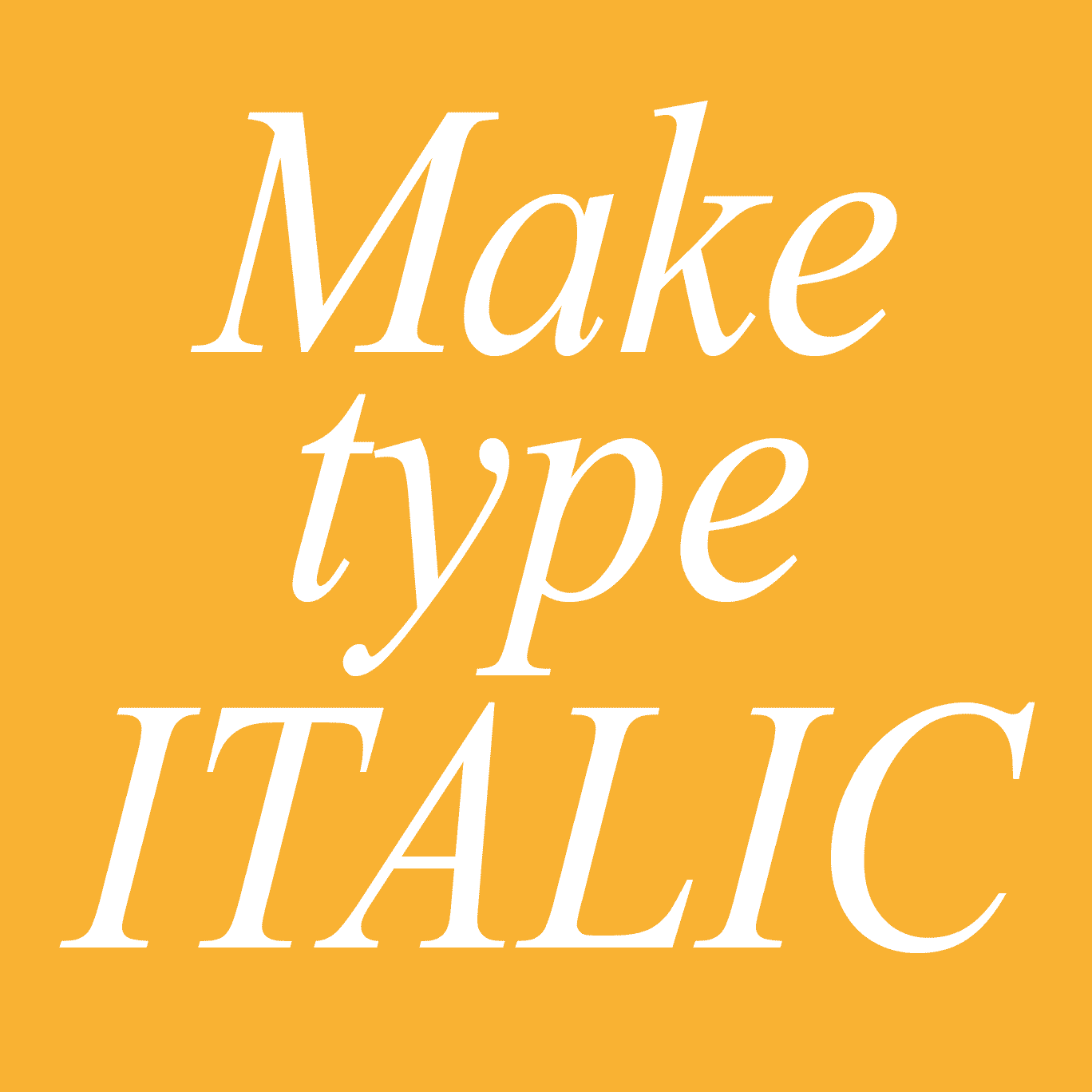
Italic Type
![]()
 Italic Type is a variation of a regular typeface which has been angled slightly to the right while keeping the baseline horizontal.
Italic type is used by designers to draw attention to words without making it obvious - if you think of bold text as shouting, then italic could be said to whisper (and as I’m sure you have seen, in a crowded room if someone starts to whisper, everyone stops talking and listens!).
 When you are choosing your main text for your branding, try to choose a typeface that has a good selection of italic typeface weights as this will give you lots of flexibility without stepping outside your branding.
Another form of lettering that is often italicised is script.
Warning: Do not confuse Italic letters with Rotated letters - the difference is really noticeable if you compare the two styles and although it is really easy to rotate letters using vector graphic programs the results can look really weird…

JPEG
JPEG stands for Joint Photographic Experts Group and is used mainly for compressing photographs into digital images.
The greater the number of pixels the higher the quality of the image, but the bigger the file size and vice-versa.
Important Note:
Once an original photo has been saved into a lower resolution format it is NOT REVERSIBLE so always keep your originals safe (and in their original format) and work with copies only.
Remember even if you save a low-resolution image into a high-resolution format it WILL STILL BE low resolution.

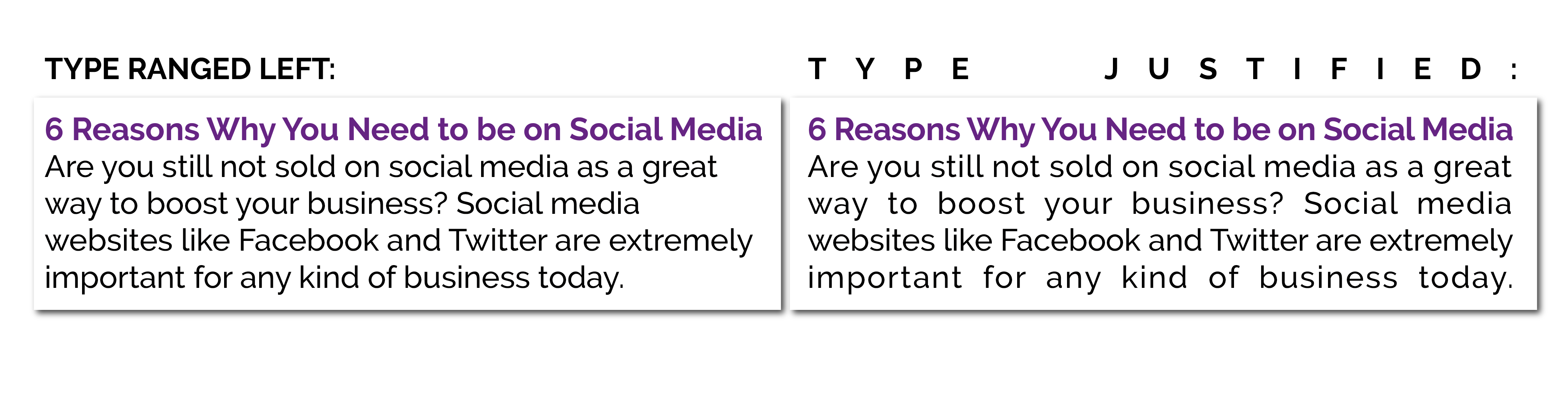
Justified
![]()
Justifying is a term applied to type.
There are four main ways to align type on a page.
Range Left has all the type in a neat vertical line on the left and a ragged edge on the right.
Range Right has all the type in a neat vertical line on the right and a ragged edge on the left.
Centred type is vertically aligned down the centre of the type leaving matching ragged edges on both left and right.
Justified type has its letter-spacing adjusted so that both left and right vertical edges are smooth and neat.
This technique is often used in books and magazines as, when dealing with large bodies of text, justifying the type makes it look neater and makes it easier for the reader.
However, when used for smaller amounts of text, justifying can result in some very odd letter spacing indeed.
Always rely on your eyes, not the computer and remember you can always adjust the odd looking spaces manually by kerning (under K in this glossary).
Kerning (the space between the letters)
![]()
Kerning refers to the white space between INDIVIDUAL LETTERS of type.
Originally, when type was set manually using individual letters the metal type had to be set side by side and no part of it overlapped.
The diagram on the right shows you how this looked.
As you can see, where letters such as A and W are side by side there is an awkward negative space between the letters.
Kerning allows you to reduce this space which makes it easier to read and a lot more pleasant to look at.
Sometimes wide-spaced kerning is used either for effect or when JUSTIFYING text.
 This is an example of how adjusting the kerning between letters can affect how it looks and also how easy it is to read.
Knowing how to adjust the kerning when you are designing will give you a lot of flexibility, but do use it with caution.
If you are interested in knowing about adjusting the spaces BETWEEN the lines of type, please see the section called LEADING.
Related Terms: Ascender, Baseline, Midline, Cap Height, Leading, Sans Serif Fonts, Serif Fonts, Decorative Fonts, Weight, X-Height
Keyline
![]()
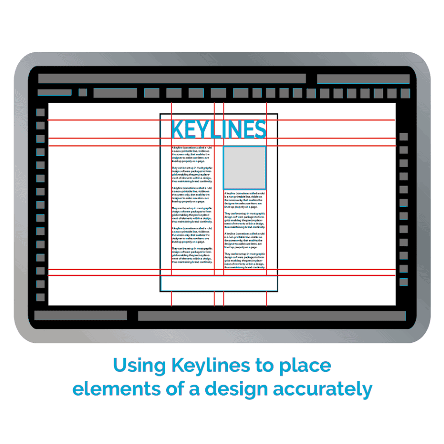 A keyline (sometimes called a rule) is a non-printable line, visible on the screen only, that enables the designer to make sure items are lined up properly on a page.
They can be set up in most graphic design software packages to form grids enabling the precise placement of elements within a design, thus maintaining brand continuity.
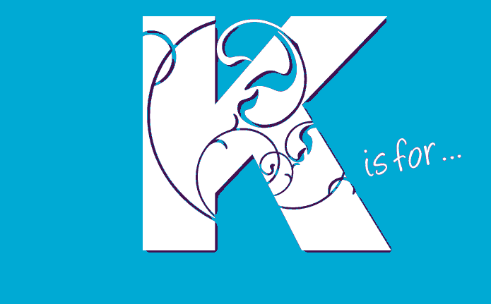
K is for Black in CMYK
![]()
Black is one of the colours in the CMYK printing process and is represented by the letter ‘K’.
CMYK stands for Cyan, Magenta, Yellow and Black and is also known as a Four Colour Process printing.
The ‘K’ in CMYK stands for the word ‘KEY’ as, in the 4 colour process, the black plate is called the Key Plate and is the plate to which all the others (Cyan, Magenta and Yellow) are aligned.
A popular misconception is that because ‘B’ has already been taken to stand for blue, ‘K’ was chosen to stand for black as it is the last letter and there are no other colours beginning with ‘K’ - this is not the reason but it is a useful way to remember!
Its Hex code is #000000
For those of you who would like to read about Black in more detail, I have provided a link to Wikipedia’s CMYK page which has lots of technical info on it!
Leading (the space between lines of type)
![]()
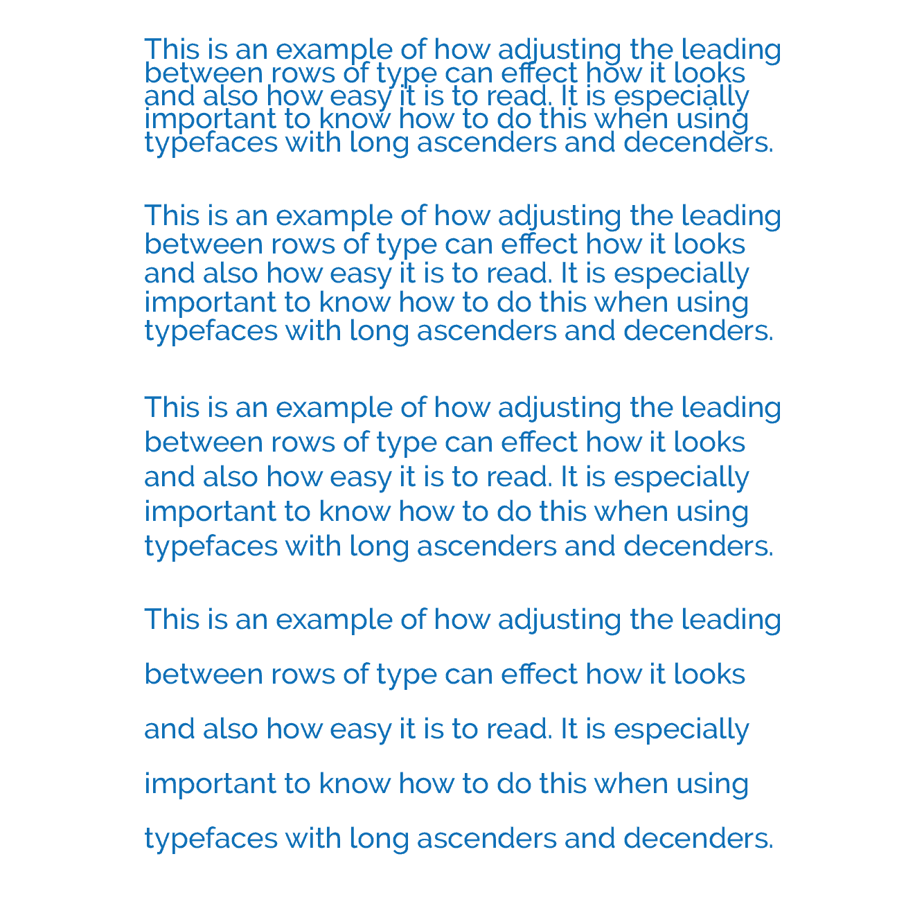 Leading (pronounced leding) refers to the white space between ROWS of type.
This is an example of how adjusting the leading between rows of type can affect how it looks and also how easy it is to read.
The space is called leading because back in the days when type was set manually, letter by letter for use on old printing presses, the space between the lines was literally a bar of lead, put there to separate one row of letters from the next and to hold them in a straight line.
Knowing how to adjust the leading when you are designing will give you a lot of flexibility and make sure your words are looking great!
It is especially important to know how to do this when using typefaces with long ascenders and descenders!
If you are interested in knowing how to adjust the spaces BETWEEN the letters, please see KERNING.
Related Terms: Ascender, Baseline, Midline, Cap Height, Kerning, Sans Serif Fonts, Serif Fonts, Decorative Fonts, Weight, X-Height
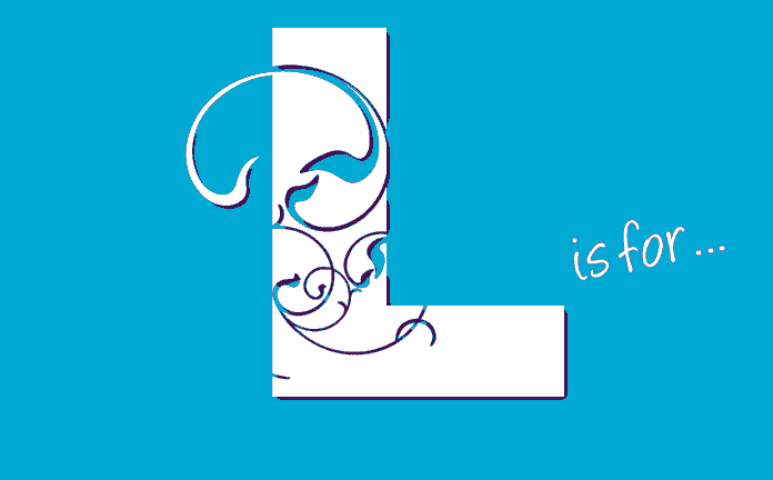
Logo
![]()
 A logo is a symbol that represents a company, and all that company’s associated values, in one memorable symbol.
It may contain just an image or just type or a combination.
The purpose of a logo is to identify a business, organisation, individual or product in the mind of the customer and this then triggers a whole range of associations (preferably good!) which potential customers will then use to help them make their buying decisions.
A logo has to be simple, memorable, appropriate to your business and above all unique.
 If you are thinking of using an ‘insert-your-business-name-here’ logo-clone company for your logo, please take a minute to click through to my blog about the subject: Insert Your Business Name Here Branding before making your decision.
If you want to read more about logos, there is lots on the website about logos, including training on how to design your own!
Lossy
![]()
Lossy is a form of data compression (e.g., Jpeg) where detail is deleted as the file size is made smaller (see Resolution and Jpeg in this glossary).
The result of Lossy compression manifests itself in bigger and bigger pixels as the program tries to average out the detail into one unit, which takes less storage space.
Lossy files are useful but do remember that quality is sacrificed.
Also, remember that this is a one-way process. While you can re-save a lossy file into a higher resolution format the quality will not re-appear.
Lower Case
![]()
Lower case lettering is the opposite of capital lettering.
 The term refers to the way that type was stored in the early days of printing when each font (style of letter) was stored in wooden cases.
The capital letters of each font were stored in the upper part of the case and the non-capital letters stored in the lower part.
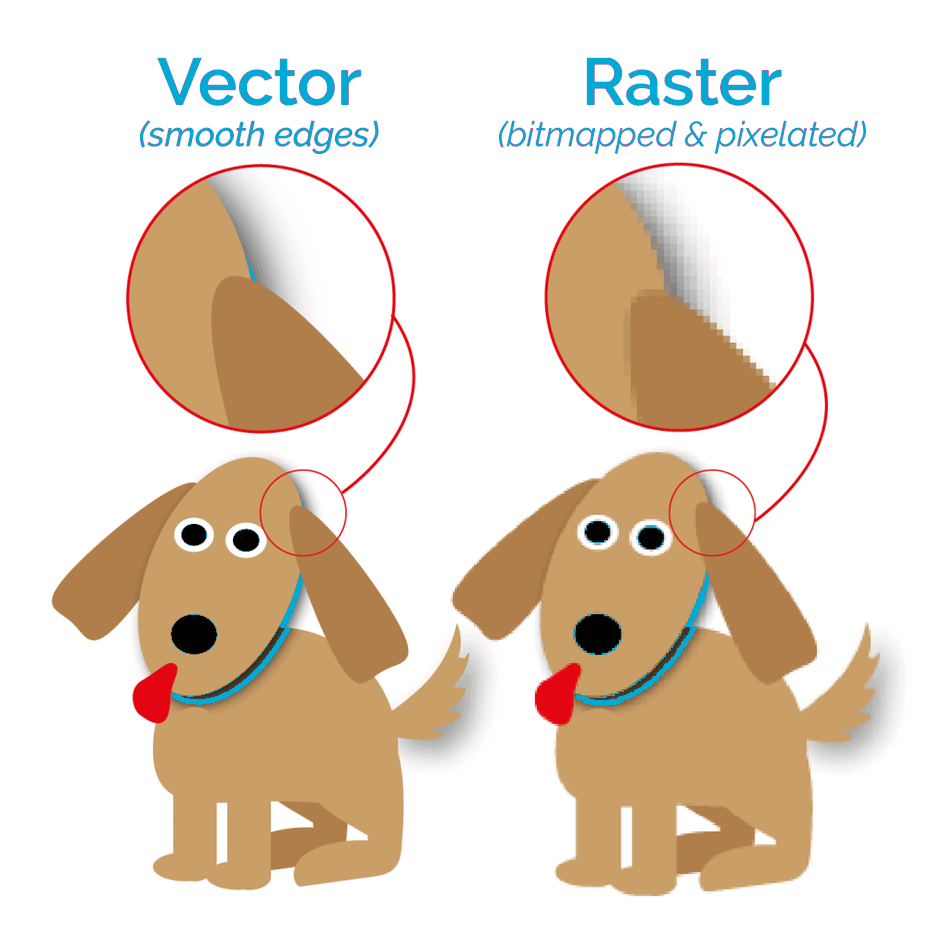
Low Resolution
![]()
![]() Low resolution is the term given to an image of low quality, which often appears to be pixelated and may contain ‘ visual noise’ (that is random pixels that seem to have colours all of their own).
Low resolution is the term given to an image of low quality, which often appears to be pixelated and may contain ‘ visual noise’ (that is random pixels that seem to have colours all of their own).
When using images or photographs the higher the resolution the better the quality. Most printers specify a resolution of 300 DPI / PPI or higher (see DPI and PPI in this glossary for more detail on these terms) for use in print.
Because photographs are pixelated to reduce the file size for digital storage you have to be very careful not to fall into the trap of assuming that because a photo says it is 300 dpi/ppi that it actually is.
Always trust your eyes!
If a photo or image that is actually saved at say, 170 dpi/ppi is then re-saved at 300 dpi/ppi its resolution will still be 170 dpi/ppi - it is a one-way process.
See Vector Graphics in this glossary to understand how to keep images smooth all the time.
Magenta
![]()
 Magenta is one of the colours in the CMYK printing process.
CMYK stands for Cyan, Magenta, Yellow and Black and is also known as a Four Colour Process printing.
Magenta is a pinkish-purple colour and is the complementary colour of green.
Its Hex code is #FF00FF
For those of you who would like to read about Magenta in more detail, I have provided a link to Wikipedia’s Magenta page which has lots of technical info on it!
Midline
![]()
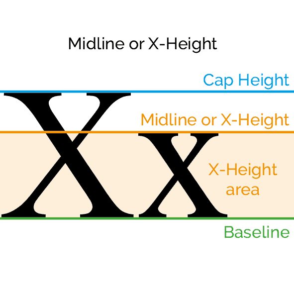 Typography has a language all of its own which can easily confuse the non-designer.
The MIDLINE is an imaginary line measured from the BASELINE to the top of the flat-topped lowercase letters – with the ‘x’ being an obvious example.
Letters with rounded tops extend a little above the MIDLINE which is more pleasing to the eye and appear in line when read.
Related Terms: Ascender, Baseline, Cap Height, Kerning, Leading, Sans Serif Fonts, Serif Fonts, Decorative Fonts, Weight, X-Height
Midtones
Midtones are the areas in an illustration or photo that fall into the mid-tonal range between Highlights (the brightest areas) and Shadows (the darkest areas).
A rule of thumb would place the mid-tone range between 20% and 80% with 0% to 19% being highlight areas and 81% to 100% being shadows, although this can vary depending on the illustration or photograph.
See Highlight in this glossary for more details.
Mock Up
![]()
A mock up in graphic design terms is a rough, often hand-drawn, version of a finished piece of work which allows the client to see the designer’s ‘vision’ of the finished advert, logo, brochure, campaign or other design item, before going to the time and expense of doing it for real, prior to the actual final design being agreed on.
Producing a mock up does take time but is well worth the effort and, although you will spend time to make it, having a mock up made could potentially save you a lot of money in the long run.
If you are designing for yourself it is especially useful to have a rough paper mock up on hand when designing brochures, booklets or folded leaflets, just to make sure your artwork is in the right place before you send it off to the printers!
Monochrome
![]()
 Monochromatic literally means ‘one colour’ and they are colour schemes created from tones of any single full saturation (100%) colour.
Single colour printing can be very effective and is often cheaper than full colour – but do check with your printer before beginning your design – if he is using a digital press you might find there is very little difference in cost from full colour and, of course, on-line there is no difference at all!

Related Terms: Colour wheel, Saturation, Printing.
Multimedia
![]()
When a designer is planning a campaign or a brand launch, multimedia springs to mind immediately.
It is no longer enough to reach out to your target market with just one type of approach any more and so even small companies need to embrace a multimedia approach.
Types of media include:
 Printed media
- Leaflets, Posters, Flyers, Brochures, Business cards, Postcards, Calendars, etc.
Website

- This is now an essential for all businesses big or small
- You do not have to be an expert to build your own basic website, you do not need to know how to code and it is actually quite affordable too!
Social Media

- Facebook, Twitter, Instagram and Pinterest are just four of the social media platforms that can really help you boost your customer base
- They are free to use and, as long as you engage regularly with your target customers by posting interesting and useful items and comments, your customer base will grow.
Video
- Is the fastest growing area on the internet, so if you have a mobile phone and something interesting is happening in your business, or if you can demonstrate a skill, video yourself and upload it to YouTube for free.
Packaging

- Bags and boxes spring to mind here, but don’t forget packaging for you and your staff too… Logos on T-shirts, Sweatshirts and uniforms look stylish and ‘packaging’ your car or van with your branding will create an excellent impression with your customers for not much money.
Radio
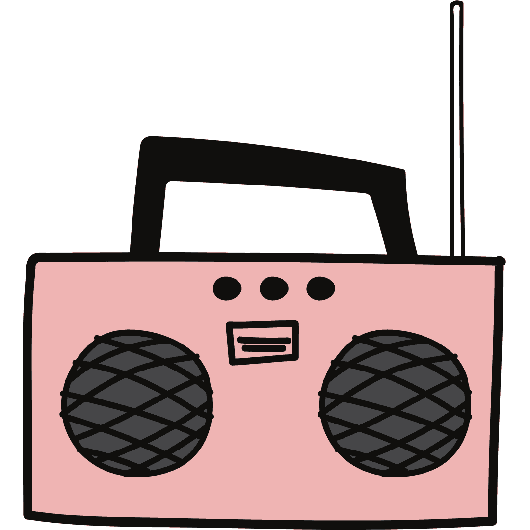
- Local Radio stations are always looking out for interesting people to interview on their shows
- If you have a story, competition, or sponsorship deal, for example, phone them up and ask. Most interviews are pre-recorded and remember (unless you are a politician) the presenter is there to make you and your business sound good to their audience. It’s a win-win situation that could reach hundreds of people in your area for free.
Press

- Newspapers and magazines can be a good place to advertise and to have articles about you and your business, but beware, a lot of newspapers will offer an article in return for an advertising fee
- You need to be absolutely sure that the targeting is right for you and that it is worth the cost in sales or awareness, or both, before agreeing
- The sales team will be very persuasive but that is their job - be wary.

Choose a Pay-As-You-Go, monthly or annual subscription.