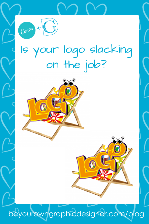
Is your logo slacking on the job?
How to tell, and what to do if your logo is!
Harsh I know, but what if your logo is the reason why your sales are not as great as they could be?
How can you tell?
Here are a few key giveaways.
1. Is your logo working hard for you everywhere you need it to be?
A good logo needs to look brilliant wherever and whenever it is used. A logo that was great for print might now be having problems on the web.
Is it readable really small (as on a mobile phone)? When it’s big does it become pixelated (for example, on the side of a van)?
Does it print well in black and white or do bits of the logo become invisible? Many firms will only print out in black and white the headed letters and invoices you email them.
Is it loading really slowly on your website and social media? On average, people will only wait 3-5 seconds for a picture to load before moving on.
If your logo is too complicated or if your file size is too big you could be driving potential customers away from your site without realising it.
Make a list of everywhere your logo appears and check it out.
You may find your logo is not working hard for you at all!
2. Does it tell your potential customers what you do?
 Even worse…does it confuse them?
Of course, you don’t have to literally draw a picture of what you do, often the name of your company will give a big clue, e.g., Silvia’s Jewellery or Posh Paws Grooming. What if you’re called something like Symonds Consulting (who do you consult with and what about?). Or ABC Promotions (what do you promote and where?)?
You know what you do but does your target market?
Perhaps you need to tell them!
Often, a slight brand refresh will be all you need to kick start your brand so don’t worry too much. With a bit of a spring clean, your logo could really start to shine again!
Does your logo tell your potential customers what you do? Share on X
3. Does your logo have a long and a short version?
 This has only really become an issue more recently, mainly because of social media templates.
Logos used to be used mainly in printed documents where a long logo was best as a header for a standard sheet of A4 paper.
However, it is now important to also have a ‘thumbnail’ version of your logo for use on the web. The thumbnail version needs to be able to work hard in very little space so it needs to be punchy, instantly recognisable and memorable for it to work.
Does your logo have a long and a short version? Short versions are a must for social media. Share on XIt’s usually easy to adapt a long logo to become thumbnail and at Be Your Own Graphic Designer we can teach you how to do this for yourself.
4. Are you using a bitmap logo?
Many business owners don’t know they are doing this. Even if your logo was drawn by a graphic designer using vector graphics, the file you are using is probably a bitmap version.
 Vector graphics have smooth edges whatever their size, and so read well very small and very big with no loss of resolution.
Bitmaps are made up of pixels which are little squares of colour – if viewed very small, the type can become unreadable and if viewed very big the pixels become very noticeable.
Pixelated files are fine for use on the web because screens only have a resolution of 72 dpi (dots per inch). However, for anything that is intended to be printed a vector file is so much more professional.
Designers work with both all the time and know when to switch between the two types.
5. Are you using a photograph in your logo?
![]() This is not a good idea – even if it is a great photo.
This is not a good idea – even if it is a great photo.
- Photos are bitmaps and therefore can look really pixelated close-up or in a large size, e.g., on the side of a van.
- Photos can become dated very easily and updating a photo-logo is very likely to confuse your customers.
- While people like to see a simple logo time and time again, seeing the same photograph over and over can quickly become annoying.
 A great way around this if you really do want to include a photograph, is to make it a graphic image, such as KFC.
The only time when a photograph can really work is if the business you are running relies on nostalgia to attract your customer base. Then a really old photo could work. But please do use caution on this one and consider an update instead.
6. It’s difficult to read quickly
In the UK it is estimated we see between 300 and 1,000 marketing messages every day. Of course, a lot of these don’t even register in our conscious minds, but a few do.
Something that all successful brands have is instant recognition and association. You need to be one of those!
Everything on the logo needs to remind people of your brand:
- Lettering needs to be clear, bold and easy to read
- Keep colours consistent – don’t vary the shades.
- Don’t change the typefaces you use – pick 3 maximum and stick to them.
- Make sure your contact details, such as your website, are written in a very clear, preferab
 ly sans serif (that means no curly edges or flicks) typeface.
 - Use more decorative typefaces for your main logo ONLY, e.g., Kellogg’s – the word has become a recognisable shape of its own. If a web address or telephone number was written in the same style it would be disastrous!
7. Overload
 All the successful and memorable logos obey the K.I.S.S. principle of design, Keep It Stylishly Simple.
Every great logo is a simple one – and this is quite difficult for many business owners to grasp.
Your logo does not have to actually show everything you can do. But by using it consistently over time, and on everything you do, it will quickly become associated in the mind of your target market with your business.
The job of your logo is to be recognisable, to represent your core business offering, your personality and your promise of service.
All successful and memorable logos obey the K.I.S.S. principle of design, Keep It Stylishly Simple. Share on X
So how’s your Logo doing?
Logos are everywhere - so you really need to make sure yours has the best chances of getting your message across to your potential customers.
Have a think about your logo and ask yourself if it is working as hard as it could be to promote your business.
If it’s just lounging around in a deckchair, sipping a cool drink and waiting for the crowds to flock in you may have a problem.
Keep in touch!
We would love to hear from you about your logo likes and dislikes so please do click through to our Facebook Group and share with us or post a comment in the box below!


