An updated version of a blog originally on our beyourowngraphicdesigner.co.uk site.
Everyone likes blue
It’s inoffensive, reliable, easy on the eye and not age or gender specific. It’s also thought of as a very corporate colour.
So, why don’t we live in a sea of blue logos? Well, there are lots of them out there, including BYOGD!
Why business likes blue - the importance of colour branding Share on XHowever if everyone chose blue, particularly dark blue, we’d all become invisible and indistinguishable from our competitors. No business, big or small, wants that!
Often small businesses are scared of choosing more than a narrow range of colours for their branding. That’s why it’s really helpful to understand how colours are interpreted as it’ll help you make a better, and maybe bolder, choice for your business.
Standard colour theory
So, how are colours interpreted? Here’s a simplified colour wheel that identifies the impact colours have on us:
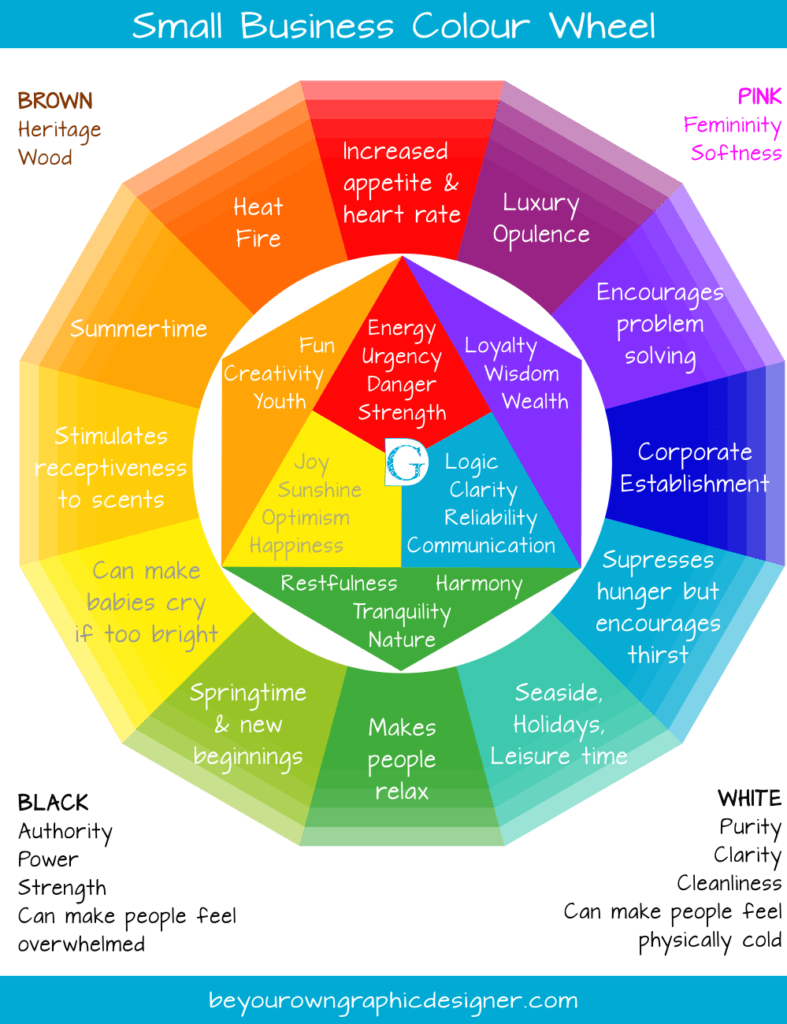
BLUE makes people think of Reliability, Communication, Logic, Clarity, establishment values. Blue also suppresses hunger but encourages thirst.
RED makes people think of Energy, Strength and Danger. It encourages appetite and increases heart rate as it also creates a sense of urgency.
YELLOW makes people think of Happiness, Sunshine, and Optimism. Though yellow also makes babies cry more than any other colour.
GREEN makes people think of Restfulness, Tranquillity, Nature and Harmony. Green makes people relax and is associated with conservation and Springtime.
ORANGE makes people think of Creativity, Youth, Fun and makes people more optimistic.
PINK makes people think of Femininity and Softness.
PURPLE makes people think of Loyalty, Wisdom and Problem-solving.
TURQUOISE makes people think of the Sea, Holidays and Leisure time.
BLACK makes people think of Authority, Power and Strength but black can also be seen as aggressive. It can make people feel overwhelmed and in many cultures symbolises death.
GREY makes people think of Quality, Timelessness, Technology and Serenity but grey can also lead to feelings of old age and sadness so use it with caution.
WHITE makes people think of Purity, Clarity and Cleanliness but can leave people feeling physically cold.
 What’s your USP?
However, it’s really not that simple – and these days to stand out from the crowd you need to take a leap of faith!
Rather than looking at the colours your competitors are using, it’s really worth thinking about what YOUR BUSINESS does and what YOUR UNIQUE SELLING POINT (USP) is.
To work out your own USP, you need to think about:
What makes your customers love what you do?
What you do that is different?
How you do it?
Where?
When you do it?
Who your target market is?
Why they would choose you over your competitors?
Then look at the colour associations above – you might find the keywords you have just generated lead you to some surprising conclusions.
What about Branding?
Branding is all about making your logo, typeface and style recognisable to customers, potential customers and competitors.
It’s so easy to go with the flow, see what works for your competitors and try to copy that, but in an oversaturated marketplace ‘owning’ a colour or colour scheme within your niche can really pay dividends!
Successfully owning a colour in your target market gives you a huge competitive advantage.
Successfully owning a colour in your target market gives you a huge competitive advantage. Share on XIt also means that every time your customers see that colour or combination of colours, especially if it is in your brand’s typeface or style, they will be reminded of you and your brand.
Here are just a few examples:
![]() Coca-Cola owns red in the fizzy drinks market.
Coca-Cola owns red in the fizzy drinks market.
 Cadbury’s chocolate owns purple in UK confectionery.
 EasyJet owns orange in the world airlines category.
 Guinness owns black in the beer market.
Kim here:
In my own social media business, Morrison Social Media, the colour I chose for my brand was purple. I became really well-known locally for always wearing purple and people are still surprised if I’m wearing a different colour!
What’s your colour?
We would both really love to hear about your brand and the colours you choose to make your own.
Tell us why you chose them and how those colours reflect the key attributes of your business and if possible upload an image too!
Hope to hear from you soon,
![]()
 What’s your USP?


Love this! I’ll def be working this into my brand as I change and evolve it. I’m glad to know also that the colors I was naturally drawn to represent feelings I would like my brand to embody.
Thank you for this. I learned color theory many years ago, but it is so good to re-learn the information, with new applications. Great chart too!
My logo colours were picked out by a colour guru to harmonise. Blue is the main colour, with pink, peach, green and purple supporting. I think of the logo as coloured raindrops on a web.
My favourite colour is pink, but I wasn’t sure that it had enough appeal across both genders. I do like purple but I’m not sure I would team it with orange!
By the way, the submit comment button is invisible unless you hover. 🙂