Branding? K.I.S.S. and move on
Why K.I.S.S. and move on? Surely building your brand is a complex and expensive undertaking not to be taken lightly.
But wait…Before choosing your brand colours it is important to discover whether it is going to be right for your audience.
Yes, your audience!
You are not trying to appeal to you, YOU are already on board…
…and you are not trying to appeal to your wife/husband/sister/brother/dog/cat or goldfish…
…and you are not trying to win prizes for a design agency with a SPECIFIC shade of whatever juxtaposed with a peculiar but distinctive hue of ….
No! Stop that right now!
You are making this too difficult… so why not K.I.S.S. the problem and move on to doing what you do best?
K.I.S.S. = Keep It Stylishly Simple
Think for a minute. Your audience is composed of ordinary everyday people, who are simply looking for a solution to their problem of the moment. It’s your brand’s job to get your solution in front of their eyes in a way they can relate to easily and instantly.
And you want to do this as quickly and affordably as possible so you can get on with doing what you are in business to do, right?
Human beings have evolved to respond to colour – sight is our primary sense after all – and, before the technology was available to show literally millions of different shades, we basically had nine.
In 21st-century computer-based graphic design, they are called Hex colours and there are a staggering 16,777,216 of them! No-one can possibly SEE all the differentiation but because a graphics computer can now mix them, all are available to bamboozle unsuspecting business owners with! Here is a link if you want to read up on them: Hex Colours.
Nine????
I know it’s a big drop from 16,777,216 but think for a minute…
In basic colour terms, here are the big 9 that humans respond to on a gut level.
And here is what the crucial nine colours are telling your audience’s gut.
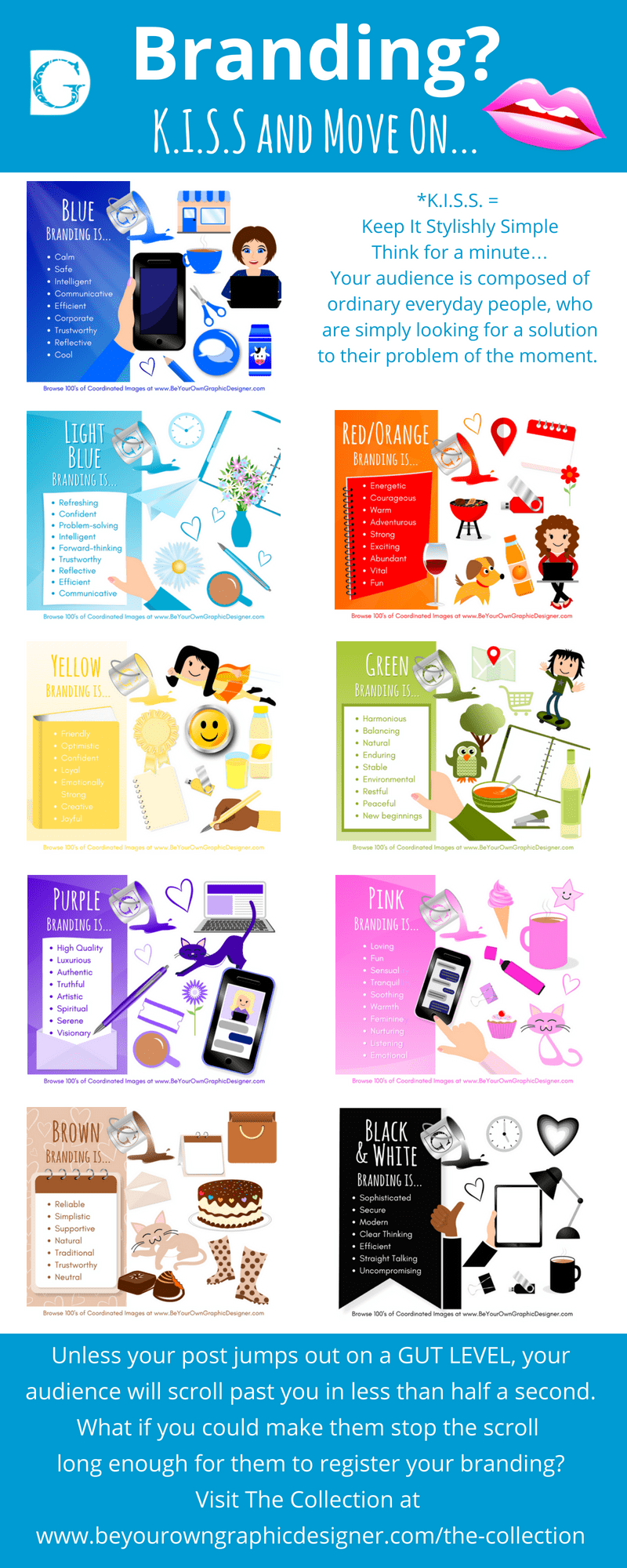
Colour Psychology in Detail
Here is each colour and their branding meaning in detail. Just click on an image to enlarge it:
 Blue branding is…
- Calm
- Safe
- Intelligent
- Communicative
- Efficient
- Corporate
- Trustworthy
- Reflective
- Cool
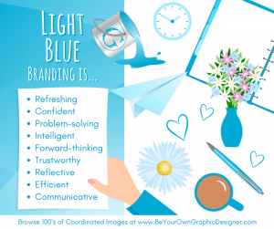 Light Aqua Blue branding is…
- Refreshing
- Confident
- Problem-solving
- Intelligent
- Forward-thinking
- Trustworthy
- Reflective
- Efficient
- Communicative
 Red / Orange branding is…
- Energetic
- Courageous
- Warm
- Adventurous
- Strong
- Exciting
- Abundant
- Vital
- Fun
 Yellow branding is…
- Friendly
- Optimistic
- Confident
- Loyal
- Emotionally Strong
- Creative
- Joyful
 Green branding is…
- Harmonious
- Balancing
- Natural
- Enduring
- Stable
- Environmental
- Restful
- Peaceful
- New beginnings
 Purple branding is…
- High Quality
- Luxurious
- Authentic
- Truthful
- Artistic
- Spiritual
- Serene
- Visionary
 Pink branding is…
- Loving
- Fun
- Sensual
- Tranquil
- Soothing
- Warmth
- Feminine
- Nurturing
- Listening
- Emotional
 Brown branding is…
- Reliable
- Simplistic
- Supportive
- Natural
- Traditional
- Trustworthy
- Neutral
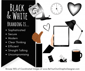 Black and White branding is…
- Sophisticated
- Secure
- Modern
- Clear Thinking
- Efficient
- Straight Talking
- Uncompromising
And understanding this is a goldmine as far as the 21st-century K.I.S.S. optimised business owner is concerned.
21st-century K.I.S.S. goldmine
Here’s why…
Attention spans are shortening and the ease of scrolling through posts on social media means that unless your post jumps out at them on a GUT LEVEL, your prospective audience will have scrolled past you in less than half a second.
What if you could make them stop the scroll long enough for them to register your branding?
You see, even though a brief pause seems insignificant, it does many things for your brand.
1. Scientists at MIT have proven that the human brain is capable of registering images in as little as 13 milliseconds. That’s enough to register your brand in the mind of your prospective customer.
“The fact that you can do that at these high speeds indicates to us that what vision does is find concepts. That’s what the brain is doing all day long — trying to understand what we’re looking at,” says Mary Potter, an MIT professor of brain and cognitive sciences and senior author of the study.
2. The Facebook algorithm recognises and rewards posts that make their audience pause in their scroll. They actively monitor the way that certain posts make people pause and others don’t. It then ‘rewards’ those posts by showing them more frequently to others in the same demographic category – e.g., people who might like your business.
3. The more times a prospective customer sees and registers your brand in their mind, the more likely they are to turn to you when they need and want whatever you are offering. This is known as K.L.T. (Know, Like and Trust) and it’s the reason why posting frequently, but NOT SELLING online is so important.
Finally, if you’d like to make things REALLY EASY for yourself, pop over to see to check out our beautiful colour coordinated, affordable and copyright free images, The Collection. We’ll even show you how to get them onto your social media super-fast and super professionally too!
K.I.S.S. your branding problems goodbye!
See you there,
xxx
